Client work · Brand · social · campaign · course design

Talstack

A learning platform, dressed for African teams. Talstack helps HR and People teams set goals, review performance and deliver training. I work across its visual brand: the social design system, the campaigns and the course design.

The Talstack logo, the square T mark beside the talstack wordmark

Client

Talstack

Role

Visual designer

Context

Learning platform, Africa-focused

Deliverables

Social system · campaigns · course design

Year

2024–now

Brand across the whole stack

The brand

One visual language, held for two years

Talstack is a people and learning platform for African teams. I carry its visual identity across everything that is not the product UI: the logo, the social design language, the launch campaigns and the course slides. The through-line is a calm, confident brand that treats people and performance software like something worth caring about.

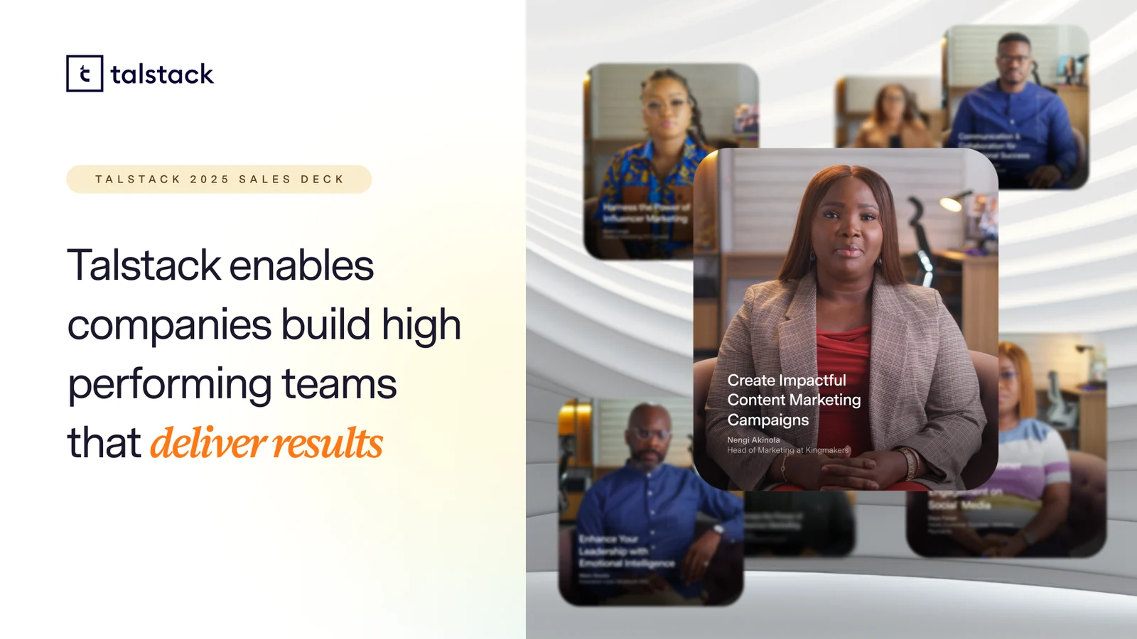
The Talstack brand applied across the 2025 sales deck: the logo, a warm neutral palette and course content fronted by African presenters
The brand, applied: the opening of the 2025 sales deck

The social system

One design document, every channel

Talstack ships a lot of announcements, so the social work runs on a design document, not one-off posts. One master layout with rules for type, photo treatment and colourways, re-skinned per audience and per channel. Design once, publish everywhere, still one brand.

Welcome to Talstack 3.0, the platform relaunch visual built from blue building blocks
Talstack 3.0: the relaunch visual, from the social design document

Proof it flexes: the partnership announcement with British International Investment. The same layout holds across the Talstack, BII and Ventures Platform skins, then reflows into email formats without losing the system.

Talstack and BII partnership announcement, the black Talstack skin
Talstack skin
The same announcement layout on the cream BII skin
BII skin
The same announcement layout on the navy Ventures Platform skin
Ventures Platform skin
The partnership announcement reflowed into the wide email format
The same system, reflowed for email

The campaign

Grow your people, grow your institution

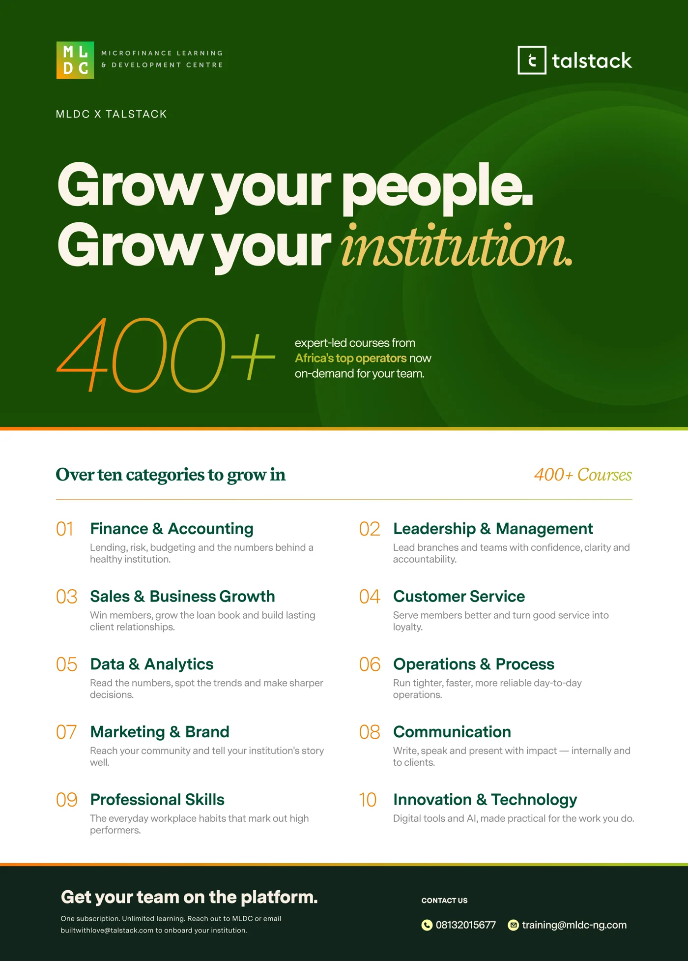
For the launch of Talstack with a microfinance training partner, I built a campaign around one promise: 400 expert-led courses from Africa’s top operators, on demand. Deep green and gold, a big serif headline, and ten course categories laid out so the offer is legible in a single glance.

The 400+ courses campaign poster: Grow your people, Grow your institution, with ten course categories
The 400+ courses launch campaign
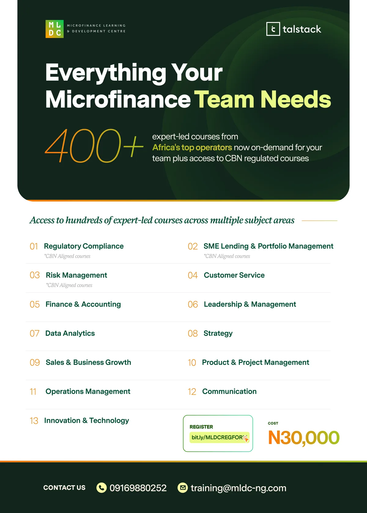
Everything Your Microfinance Team Needs, the 400+ expert-led courses flyer with thirteen subject areas
The offer, spelled out: 400+ courses across thirteen subject areas

Grow your people. Grow your institution.

Course design

Making the content look like the brand

A learning platform lives or dies by its courses, so the lessons got the same care as the homepage. I built a slide system for the non-instructor-led courses: one grid, generous type, a soft gradient motif, and numbered cards that keep dense material calm and scannable.

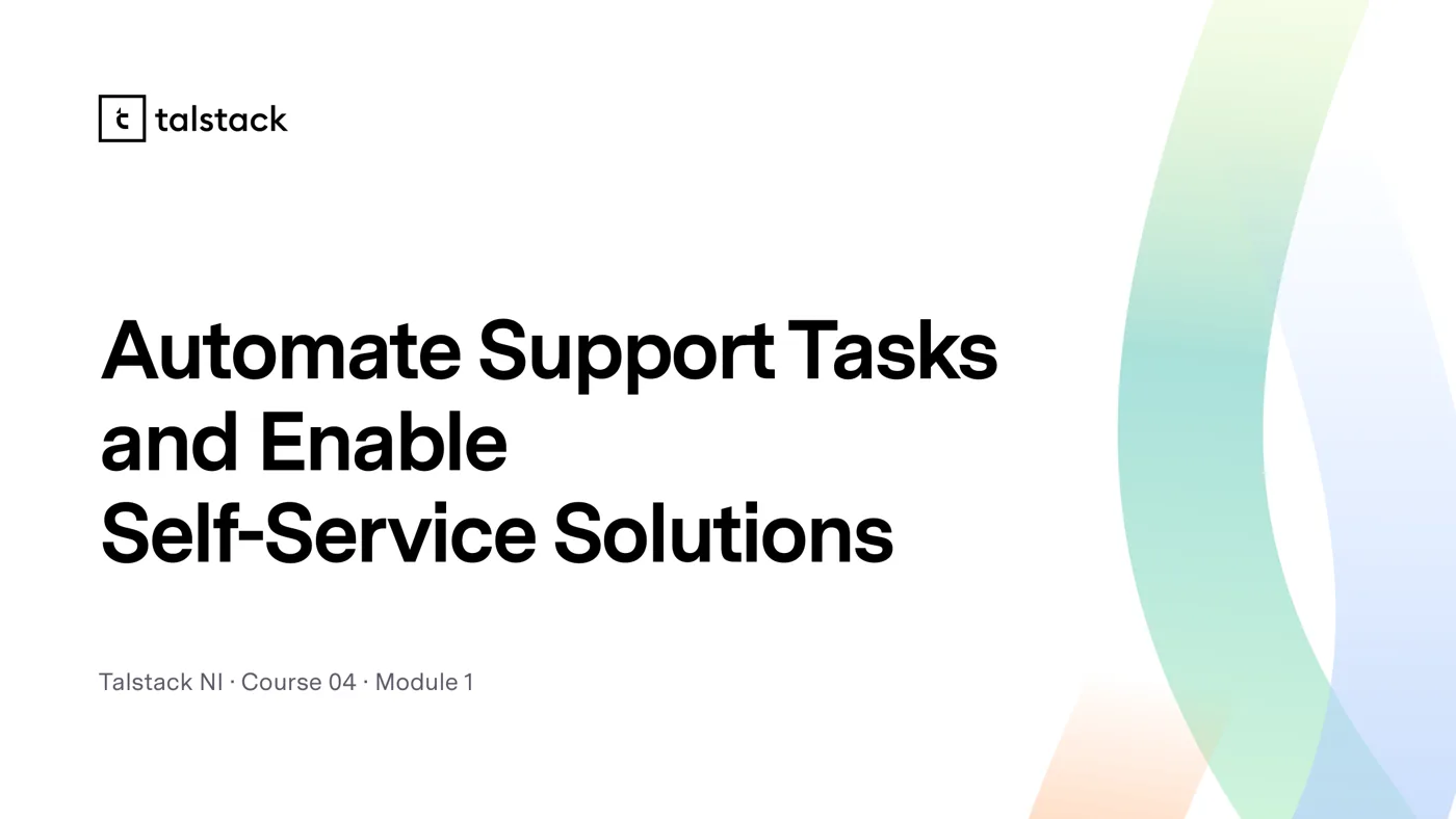
Talstack NI course title slide, Automate Support Tasks and Enable Self-Service Solutions
Course title
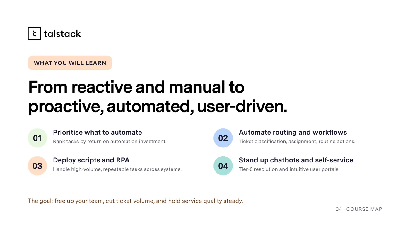
What you will learn slide, four numbered outcomes on a grid
What you will learn
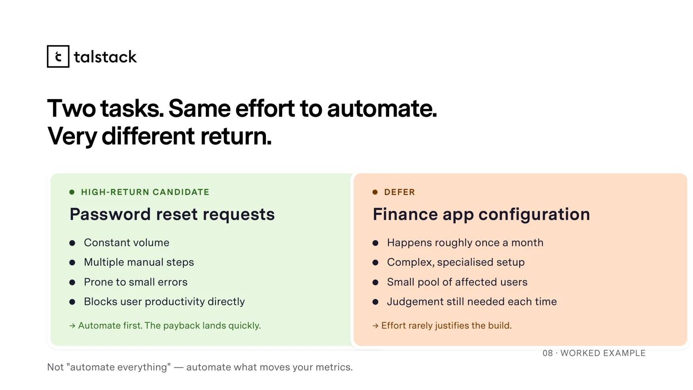
A content slide from the Talstack NI course system
Inside a module

Outcome

One brand, every surface

Across two years I have carried Talstack’s brand through social, campaigns and course design. It is the deepest engagement I have had: the same visual language, held steady from a partnership announcement to a course slide to a launch poster, for a brand building the future of work in Africa.

400+

Courses fronted by the launch campaign

10

Course categories, one legible campaign grid

2yr

Brand held across social, campaign and course design