Case study 01 · Brand identity
Kabs Diner
A casual diner built to be felt before it’s explained. A full brand, from the signature logo to menu naming to the live website. Good food. Good drinks. Great nights.
Client
Kabs Diner
Role
Lead designer, identity & direction
Context
Independent studio
Deliverables
Identity · packaging · menu · apparel · signage · web · social · motion
Launch
2026
From brief to rollout
Research & positioning
Competitive scan · diner personas
Casual dining brands around the market all sell the same way. They describe the food. Ingredients, discounts, delivery apps. Nobody sells the table, the feeling of already missing the best seat in the room.
Two diners drive the brand. The hometown local finally finding a place that matches their standard, and the city explorer willing to travel for the right vibe. Both are taste-driven. Neither can be talked into anything, so they have to be shown.
- 01
The market describes; it doesn’t seduce. An identity that behaves like a personality wins by default.
- 02
Dish names are free media. A menu written in unmistakable Naija slang doubles as a social-content engine.
- 03
The room is the product. Every asset should make you feel the place before you’ve read a word about it.
Strategy
Positioning · voice
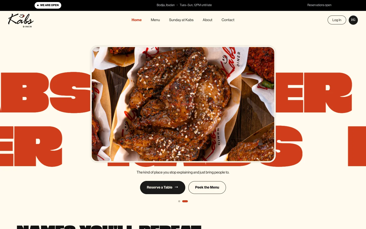
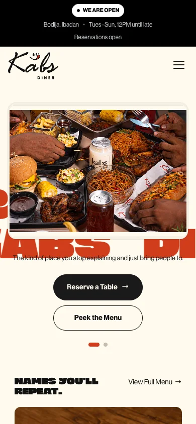
The positioning was simple: a destination, not just another place to eat. Loud where it counts, calmer where it should be. A hand-brushed signature, a confident retro display face, and a system flexible enough to live on a takeaway bag, a neon-lit wall, or a Saturday-night reel.
The kind of place you stop explaining and just bring people to.
Identity & system
Logo system · colour · type
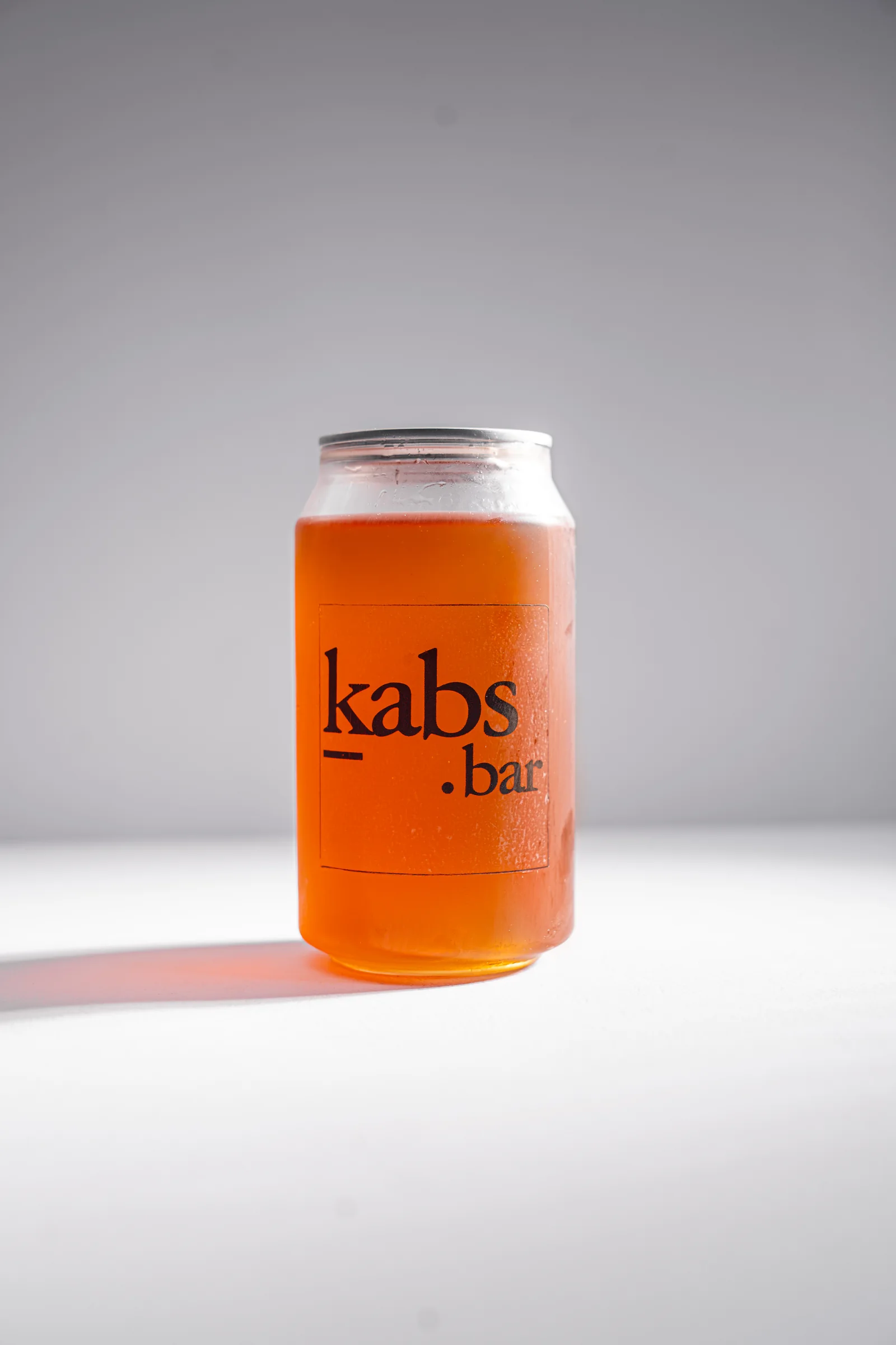
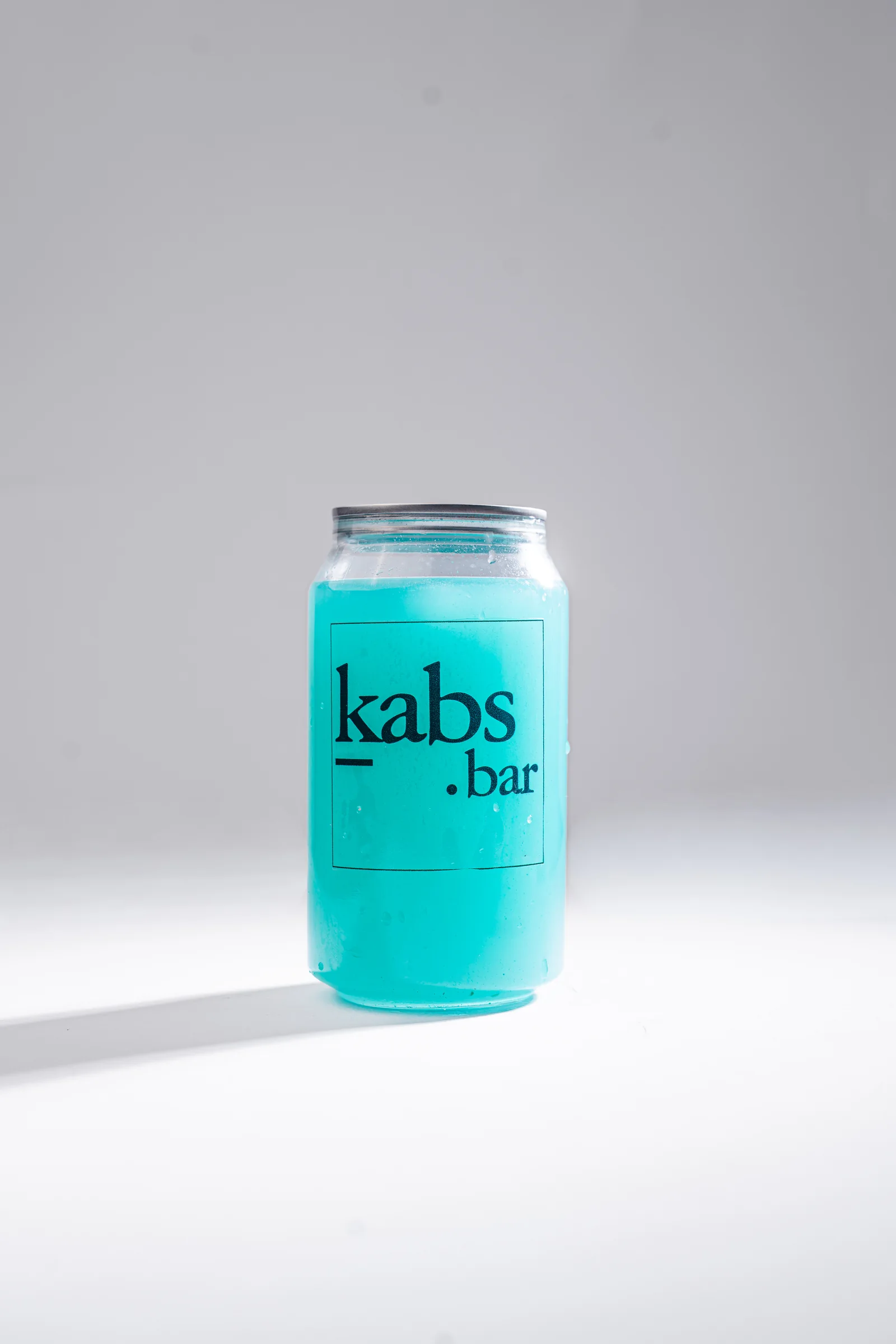
A three-part logo system: the full signature lockup, the brushed primary mark and a standalone “K”. That range lets the brand scale from storefront signage down to an avatar. Six colours and three typefaces, each with one job.
Good food. Good drinks. Great nights.
The client-approved brand line. Three beats that name the whole promise.
Rollout
Menu · voice · packaging · motion
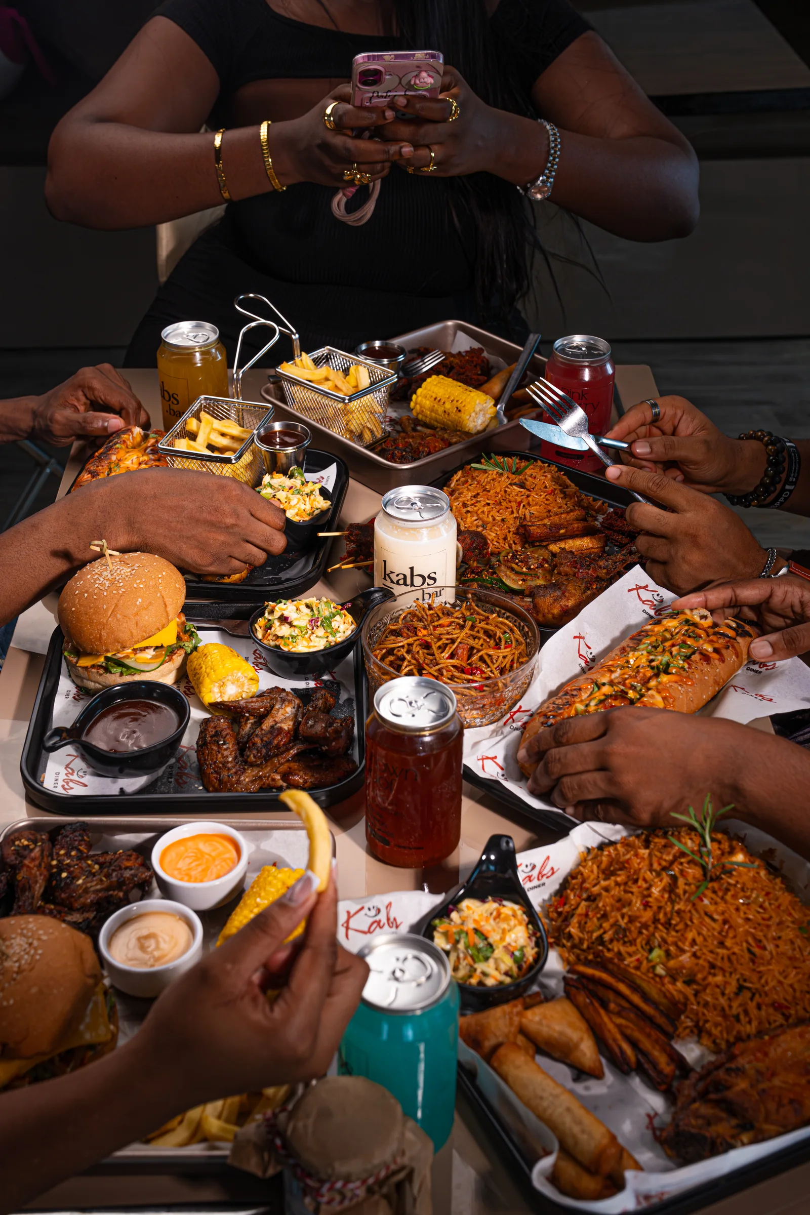
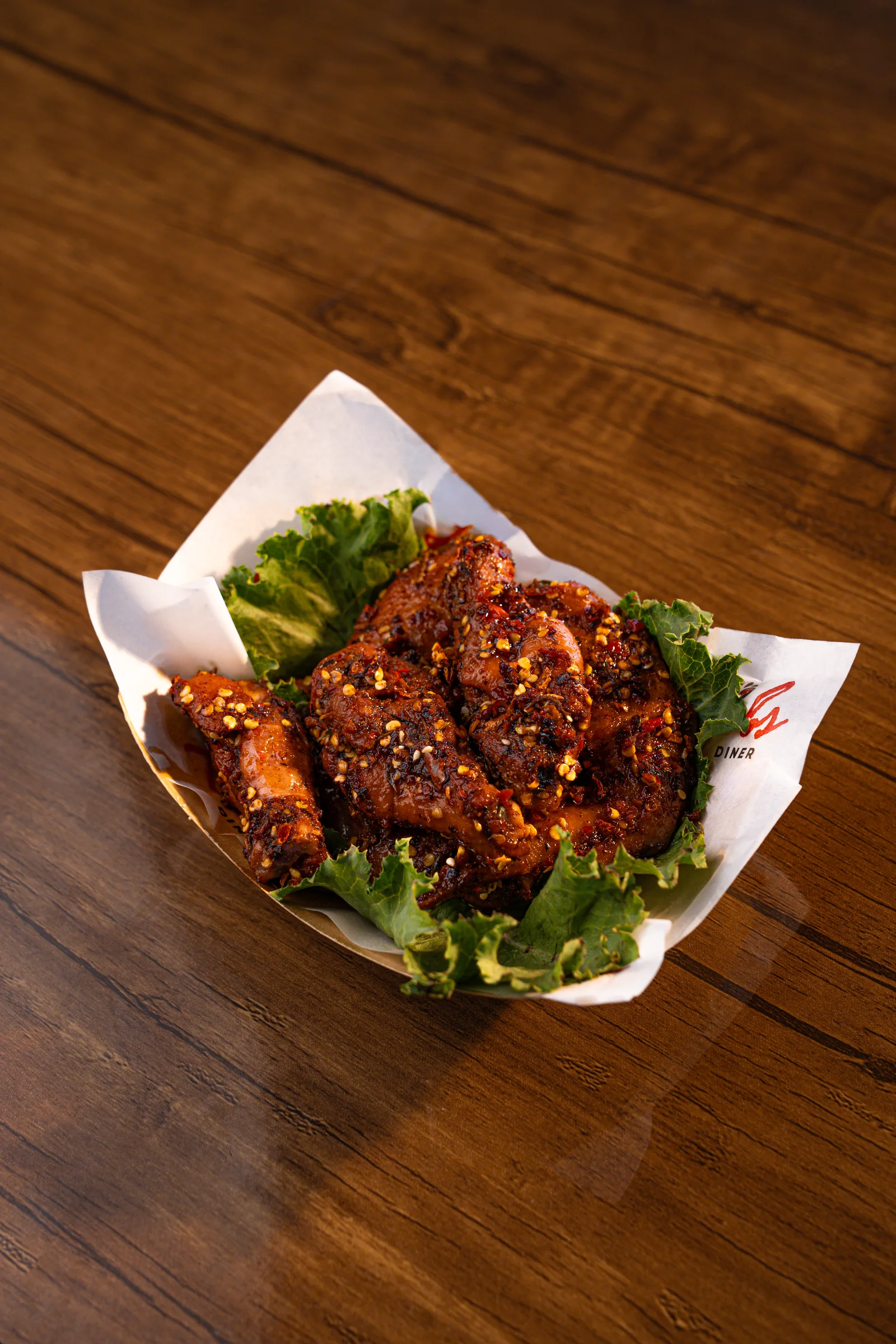
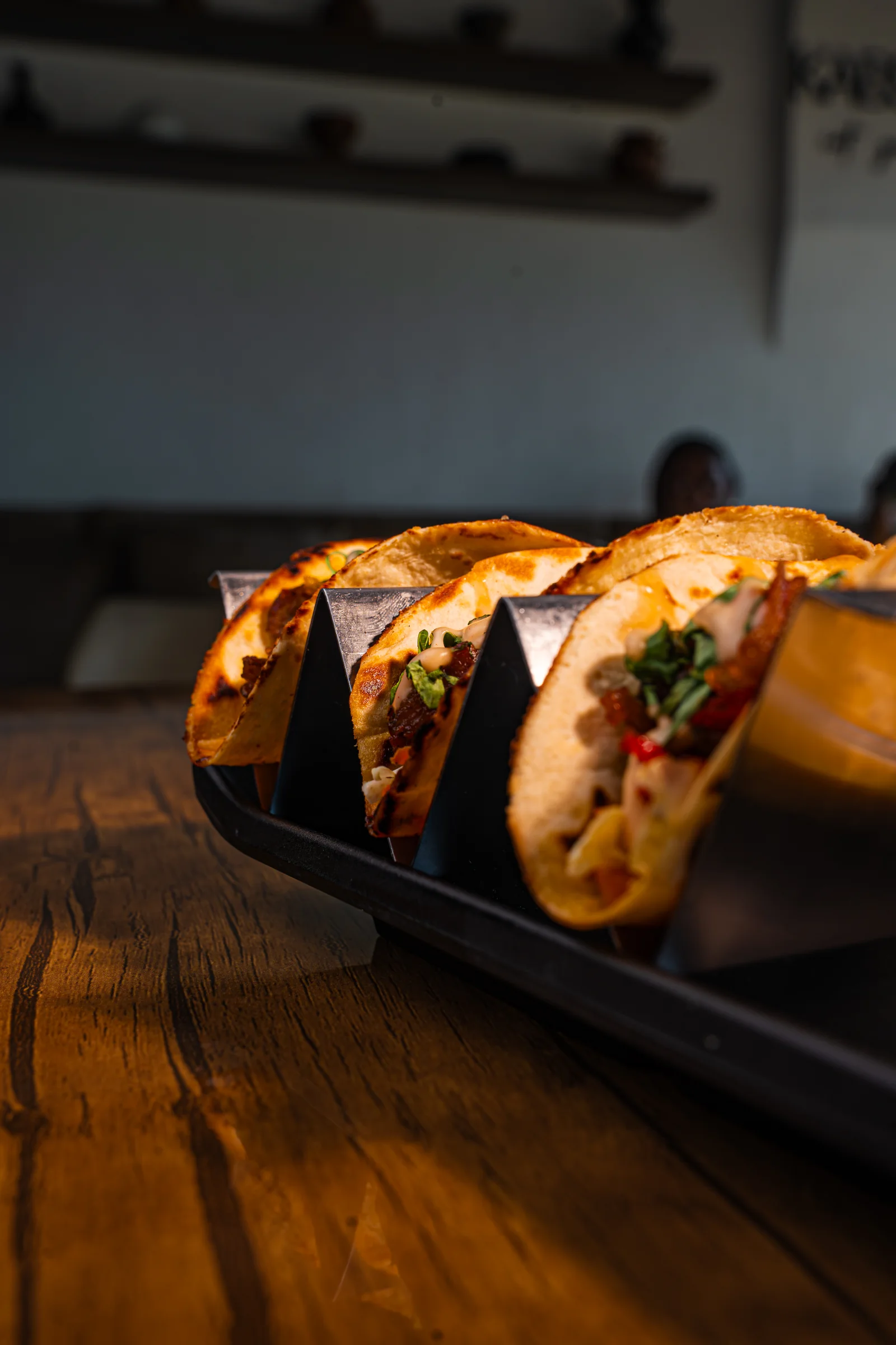
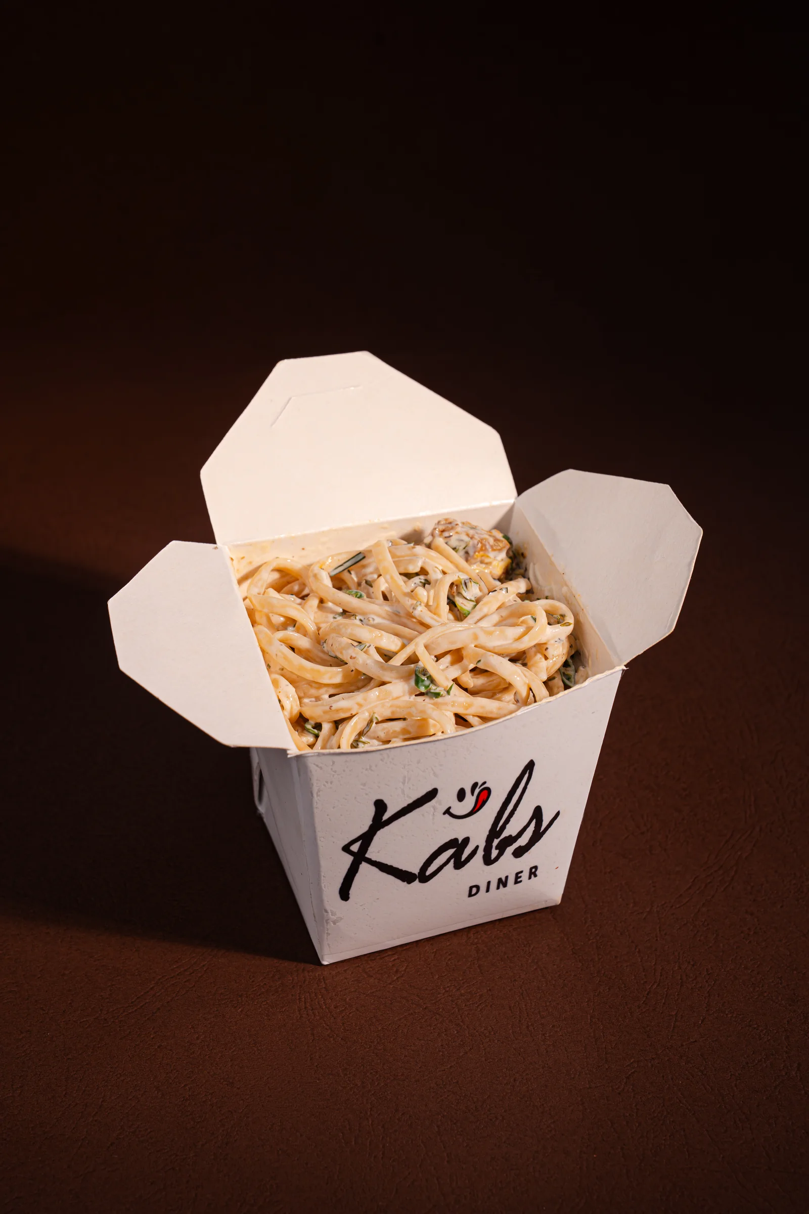
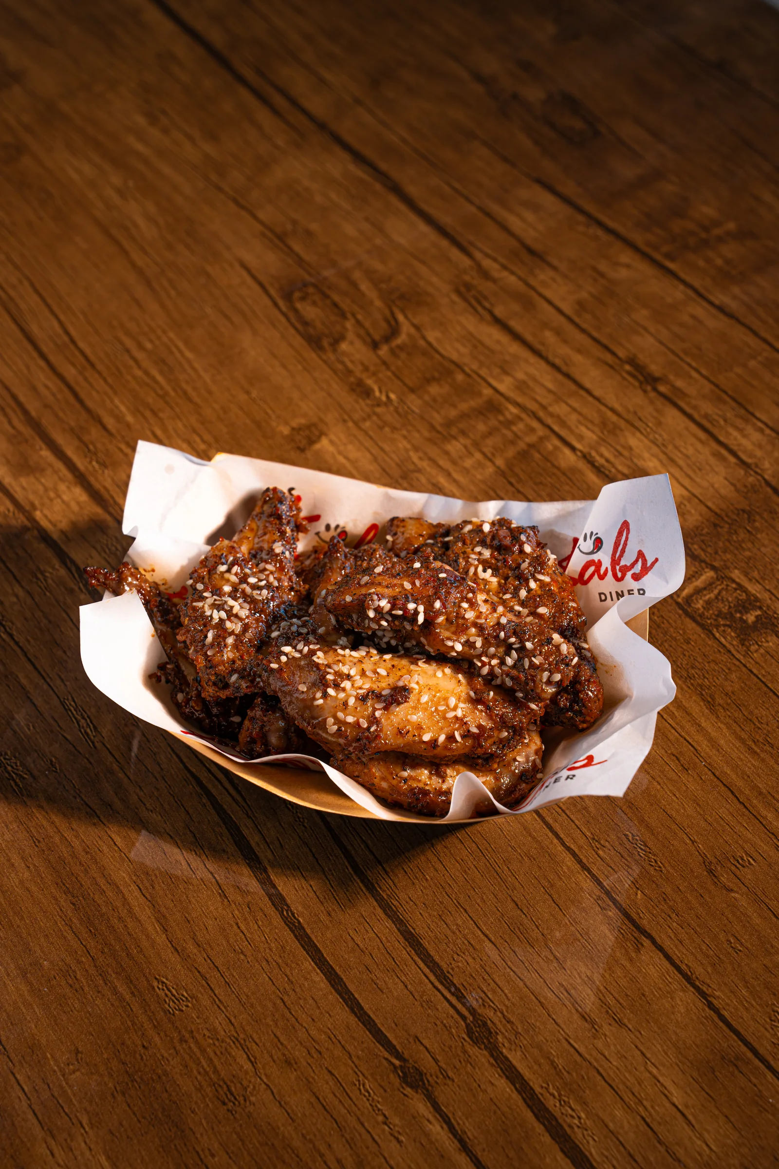
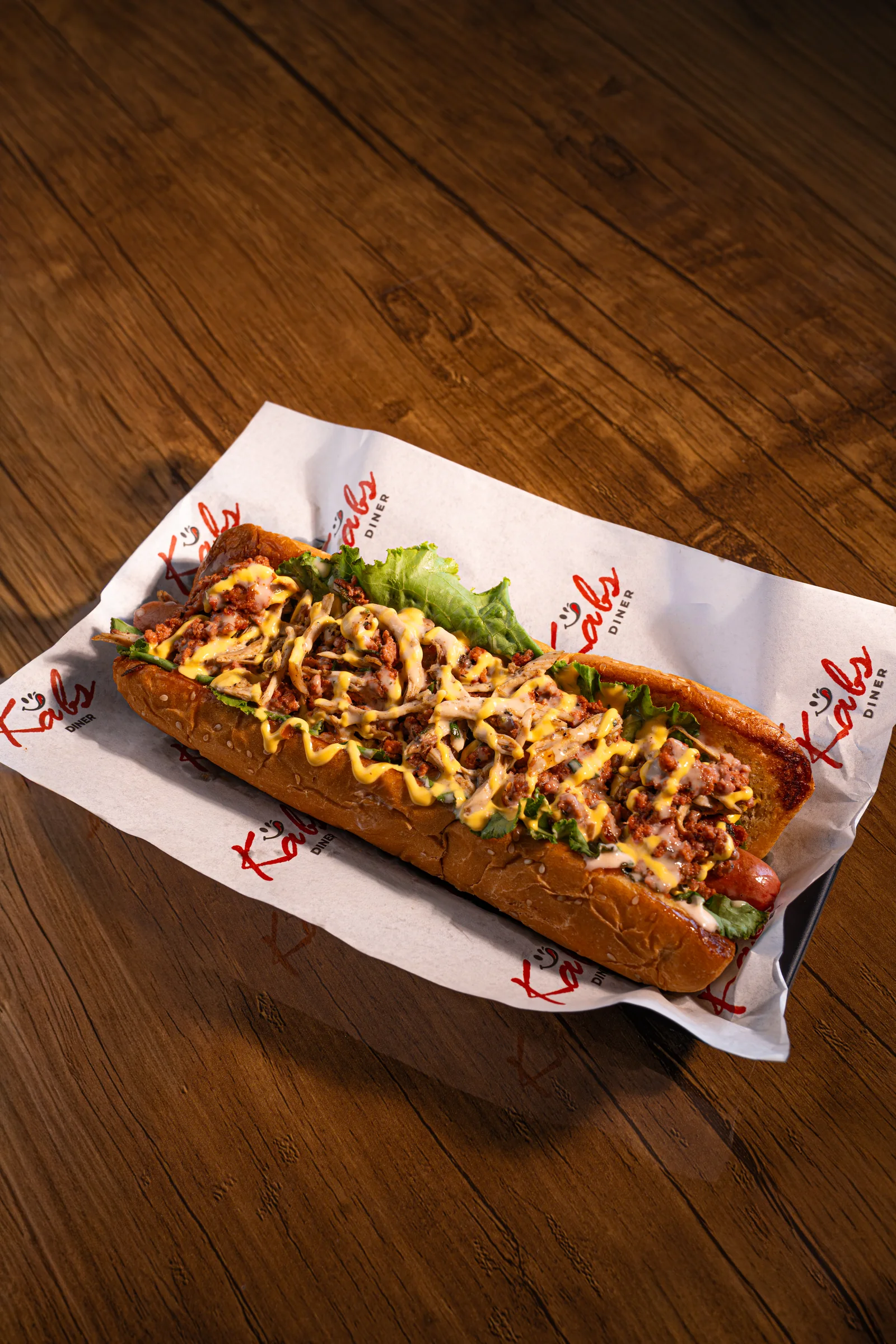
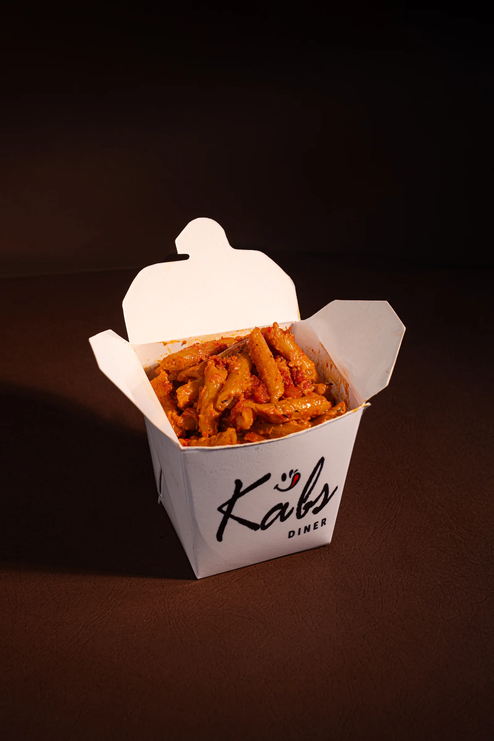
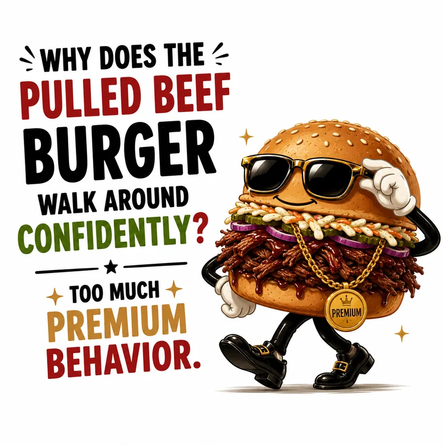
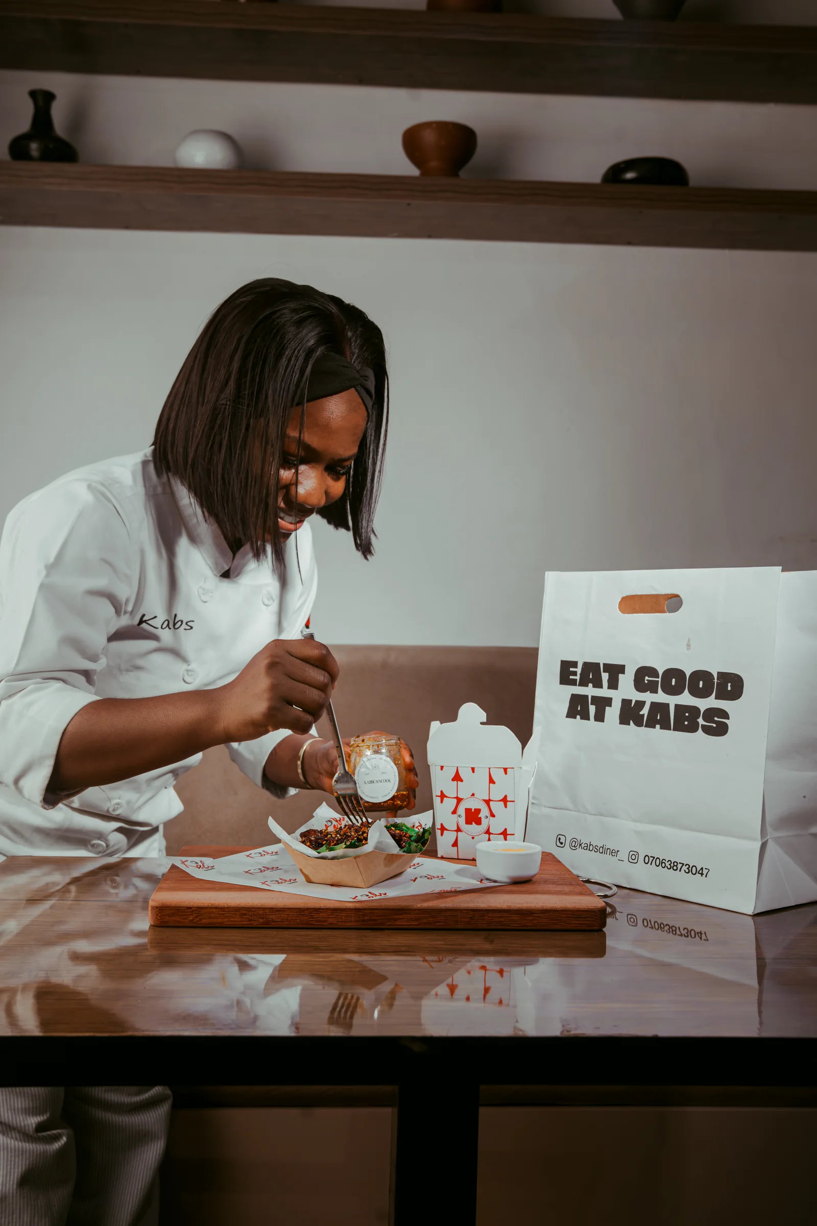
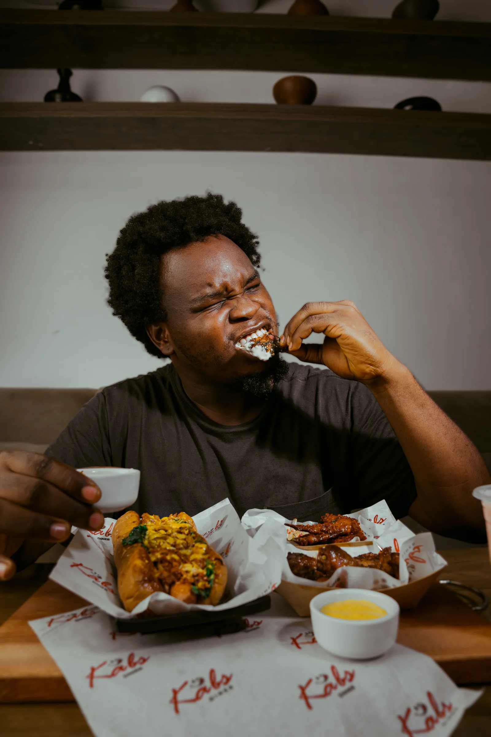
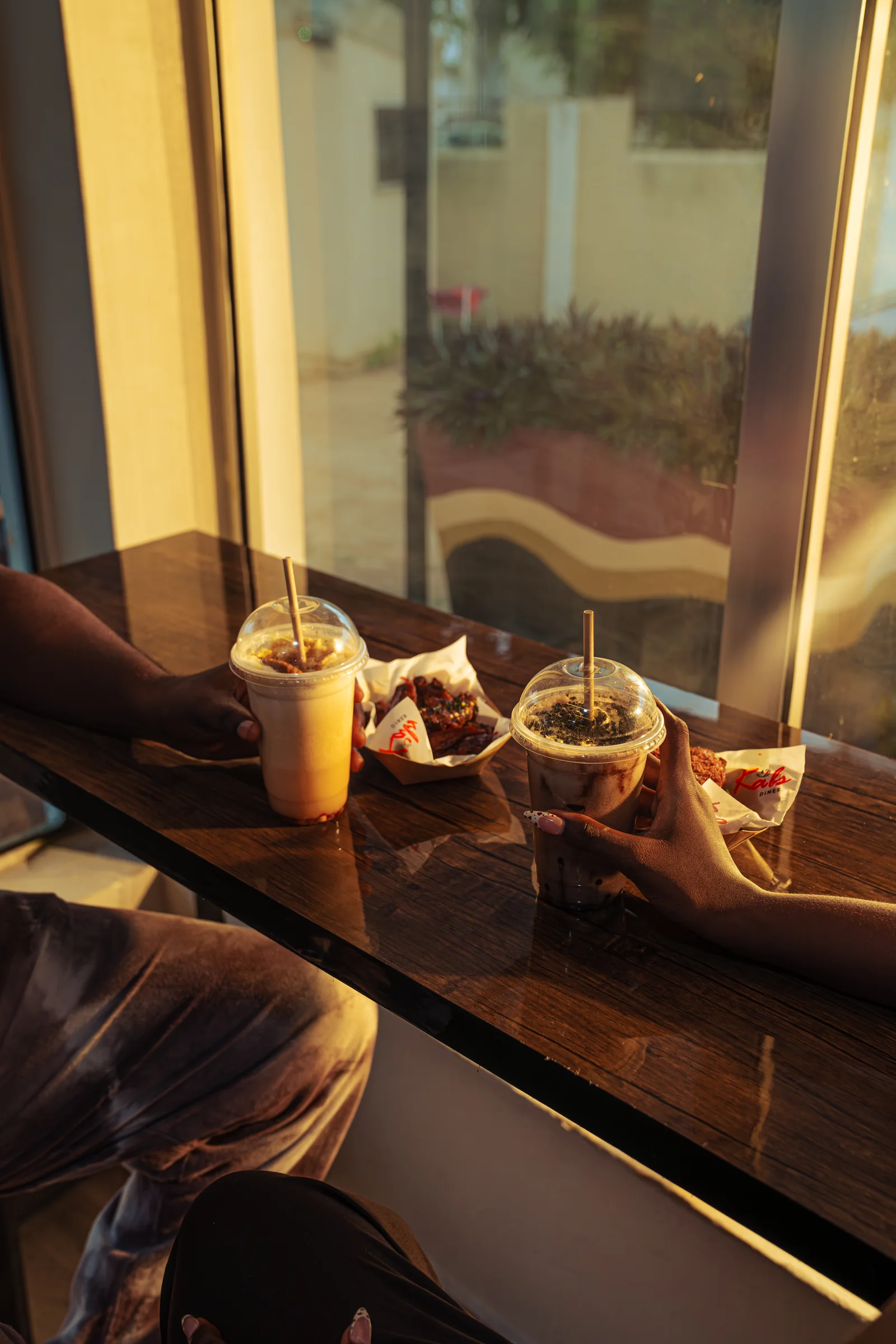
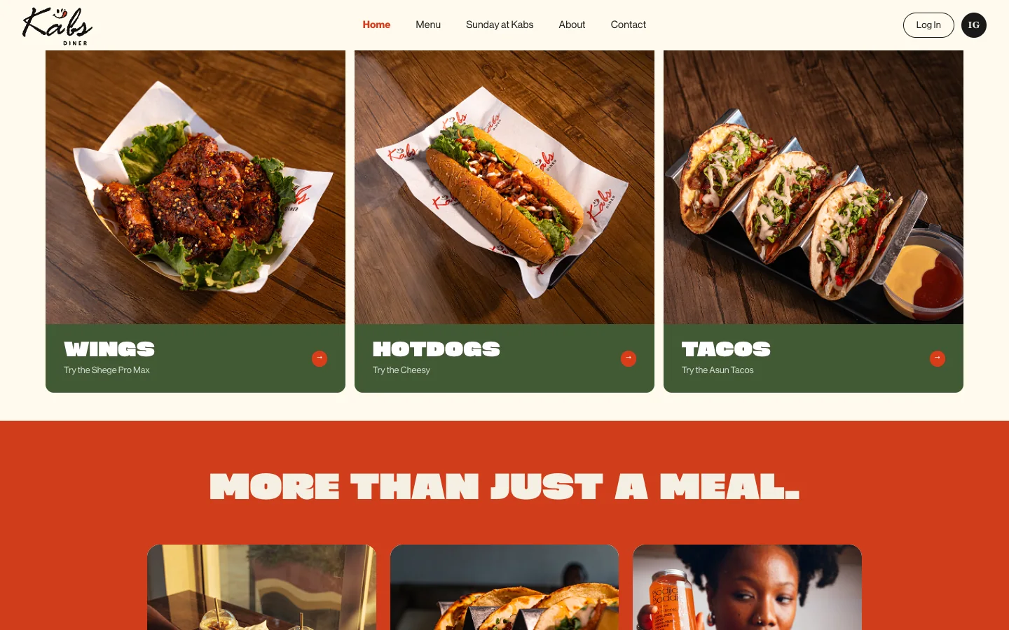
Every plate is a poster. The menu is named in unmistakable Naija slang, so each dish becomes a conversation starter, art-directed to carry the feed on its own.
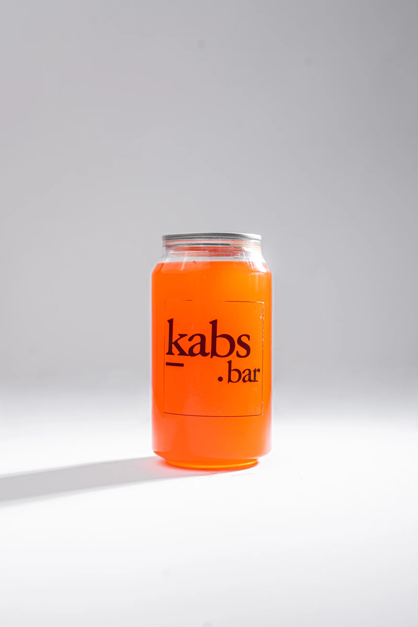
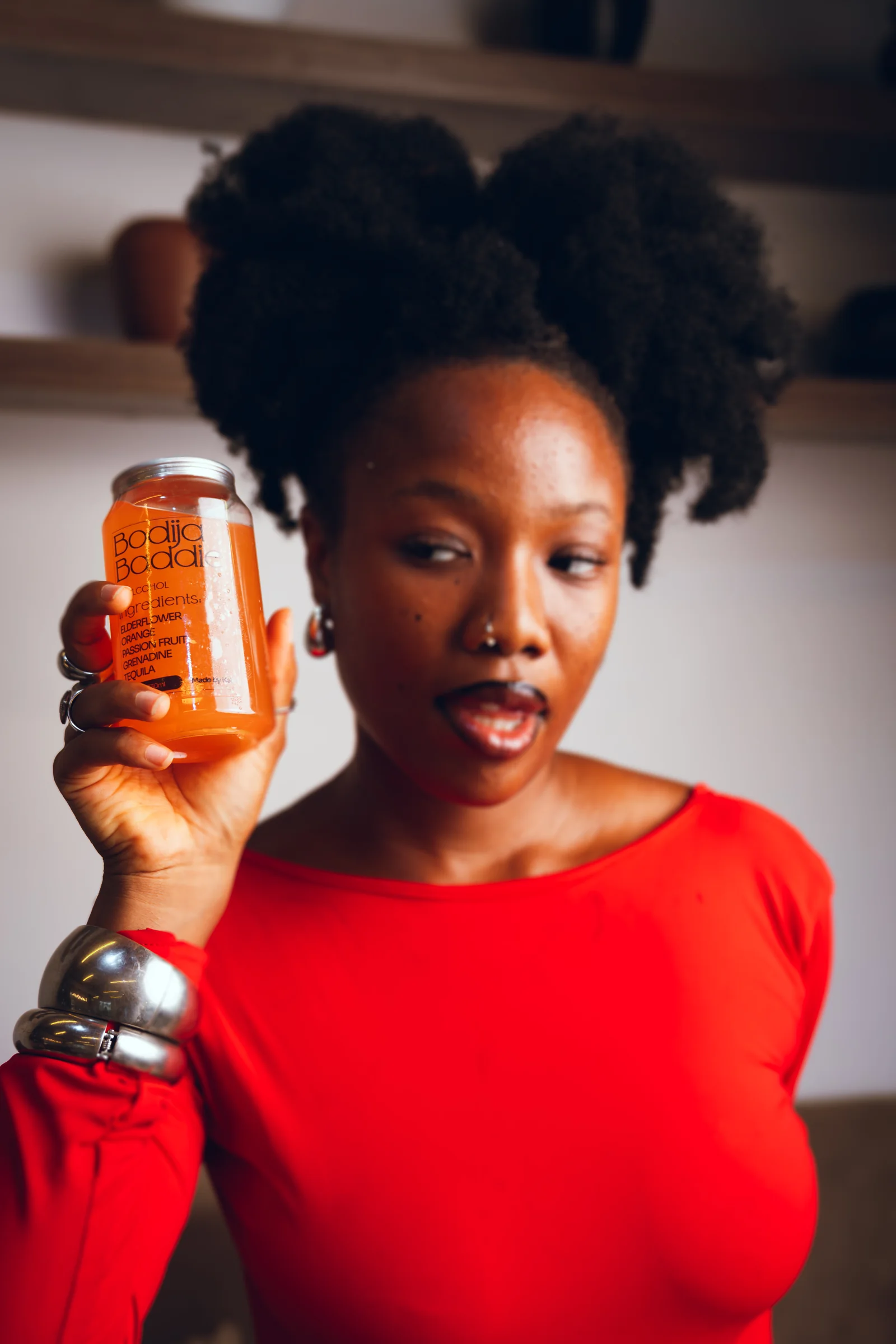
The bar carries the brand too. A signature cocktail and mocktail list, each poured into the branded kabs.bar can. The drinks are as photogenic as the plates.
Three caption modes keep the voice consistent without a copywriter on call: the Statement (one confident line), the Name Drop (just the dish), and the Blank (when the photo is already a sentence). A client-approved mascot carries the jokes.
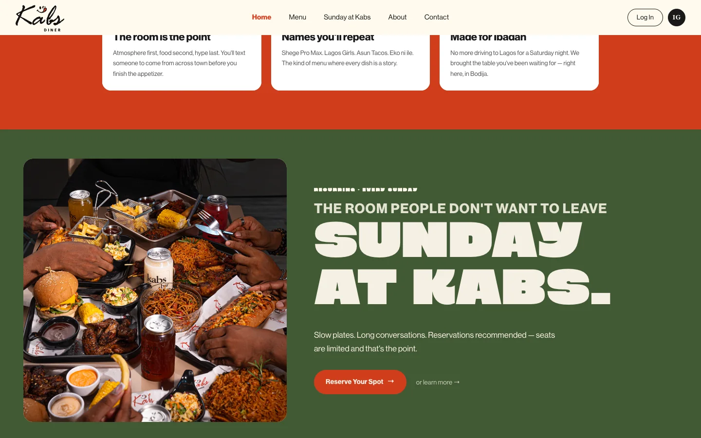
And it lives in the room. The identity carries through the chef, the lifestyle and the shared table. That is the atmosphere the brand promised.
Secondary logo reveal, built in After Effects for launch teasers.
Product design: the website
Design → build → live
The brand didn’t stop at the logo. It went to the web. I designed and shipped kabsdiner.com: an oversized-type storefront, a menu that reads like a highlight reel, a “Sunday at Kabs” reservations moment, and full responsive down to the phone. Same voice, same system, now a product people book a table on.
kabsdiner.com. Designed in Figma, built and shipped live.
Outcome
What shipped
A complete brand: logo system, colour, type, packaging, menu naming, apparel, signage, a live website and launch motion. All of it built so Kabs Diner opens as a destination, not a stop. The table you bring people to.
“They are so cute. I like them.”
The owner, on the mascot designs, who also said, “Thank you and well done.”
9
Brand surfaces shipped: identity, packaging, menu, apparel, signage, website, social, motion
17+
Dishes & drinks named and art-directed as a content engine
1
Live website designed, built and shipped: kabsdiner.com