Case study 05 · Launch identity
Modiva Scents
A scent you see before you smell. Fourteen pencil sketches, one tulip mark, and a launch the audience had to earn. Four teasers of backlit glass before the reveal.
Client
Modiva Scents
Role
Brand designer
Context
Independent studio
Deliverables
Identity · launch campaign
Year
2026
From brief to rollout
Research
Category codes · buying behaviour
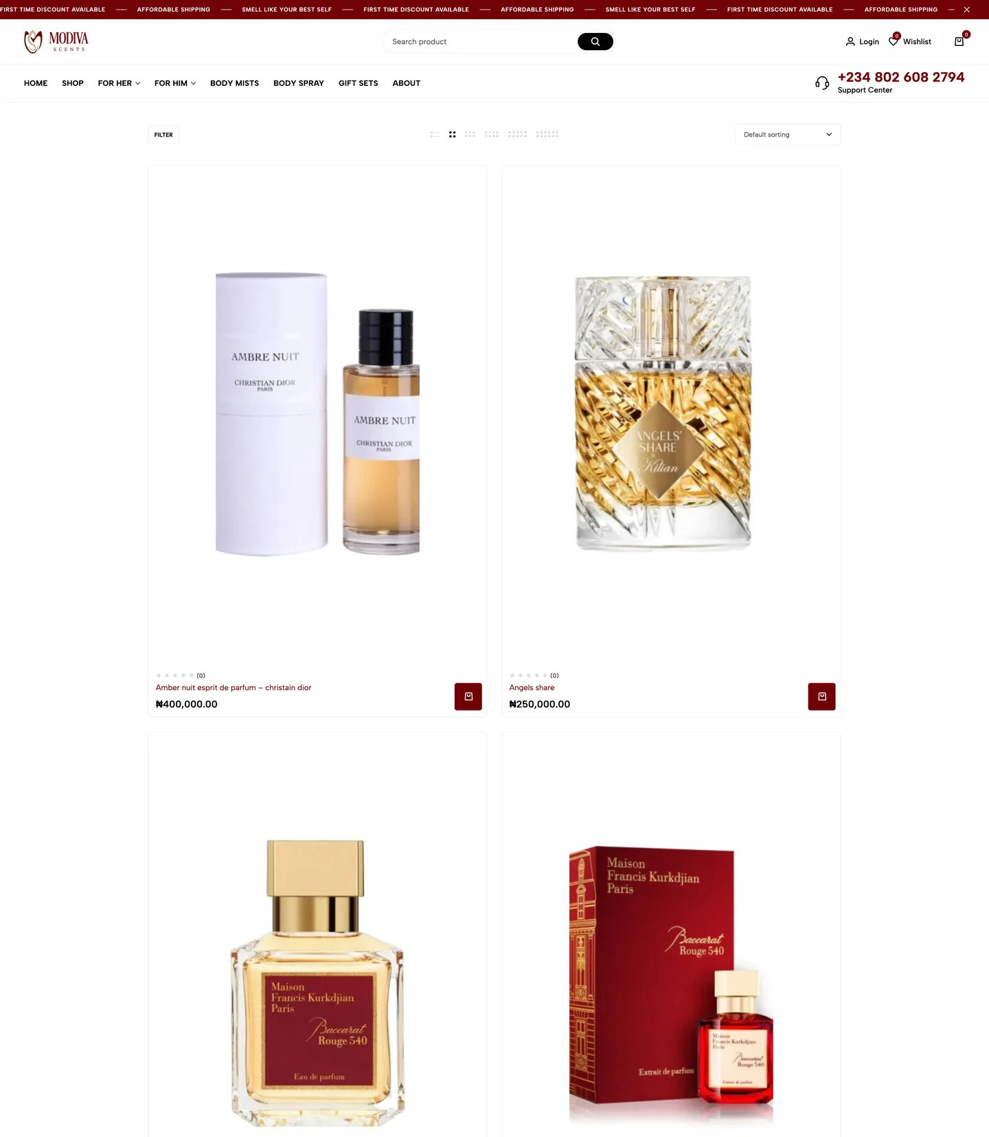
Fragrance is bought with the eyes first. Nobody smells a post. Photography, type and light do the persuading long before the nose is consulted, and the purchase is half-made by the time the cap comes off a tester.
The category codes are strict: dark luxury, warm light, serif restraint. Break them and a new brand reads as cheap; own them with discipline and it reads as established. Modiva had a second problem: a brand new name with no history. The mark had to feel like it had always existed.
- 01
The eye buys first. Art direction is the product until the bottle is in hand.
- 02
Category codes are a password. Dark luxury, warm light, serif restraint. Speak them fluently, then add an accent.
- 03
A new name needs old bones. The mark must feel established on day one, not launched.
Strategy
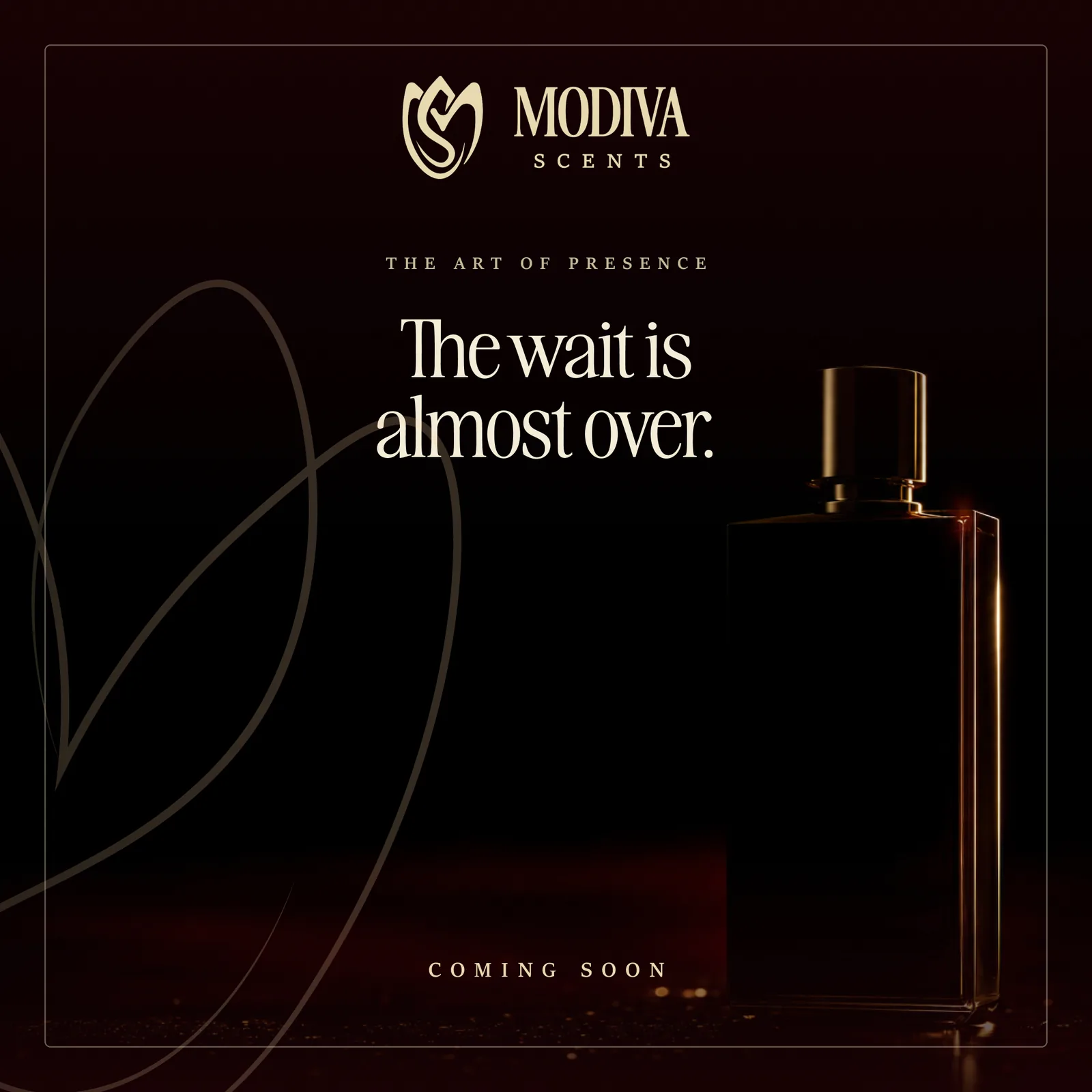
Tease → reveal
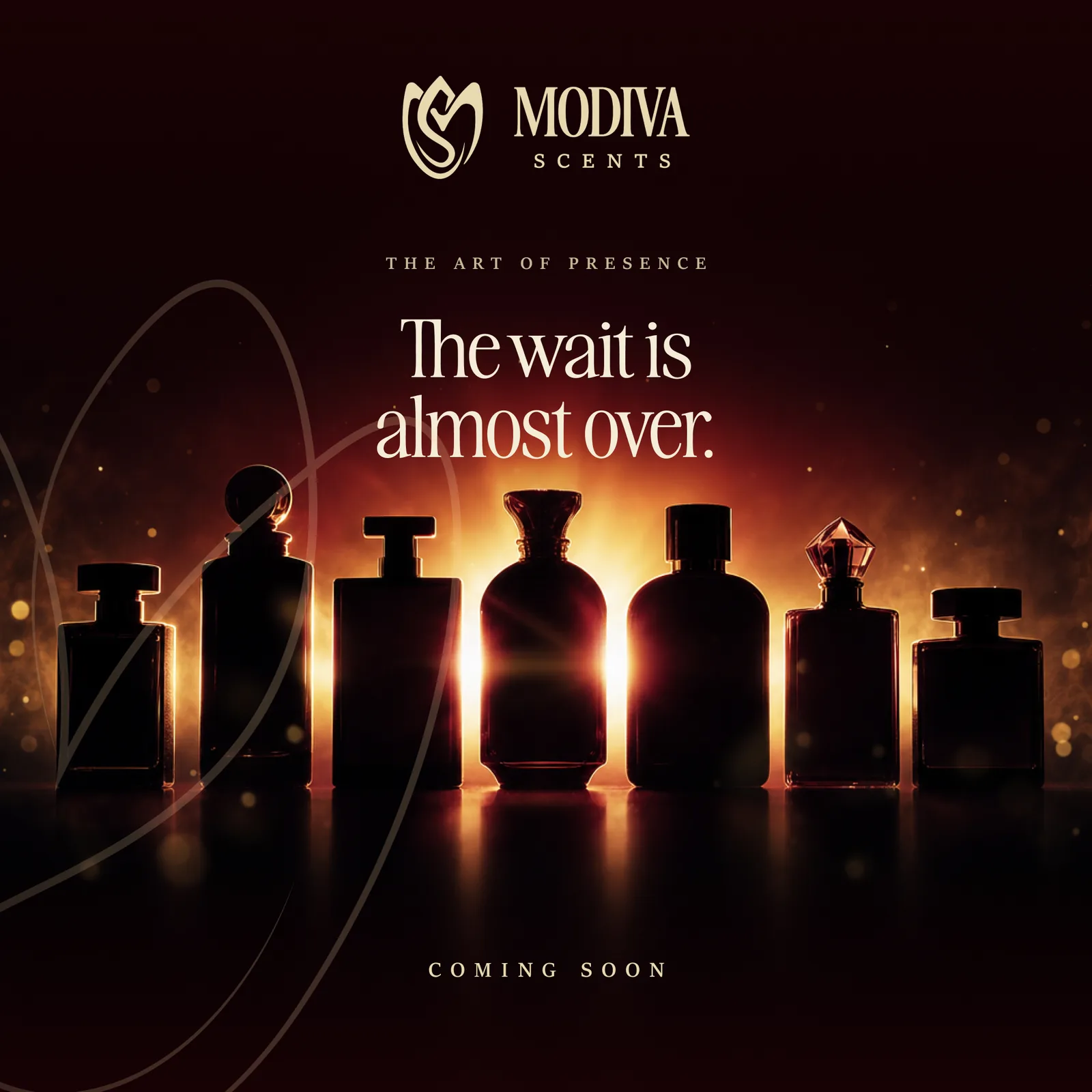
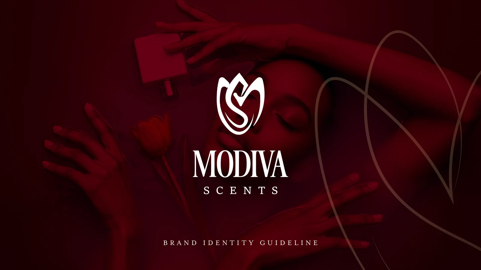
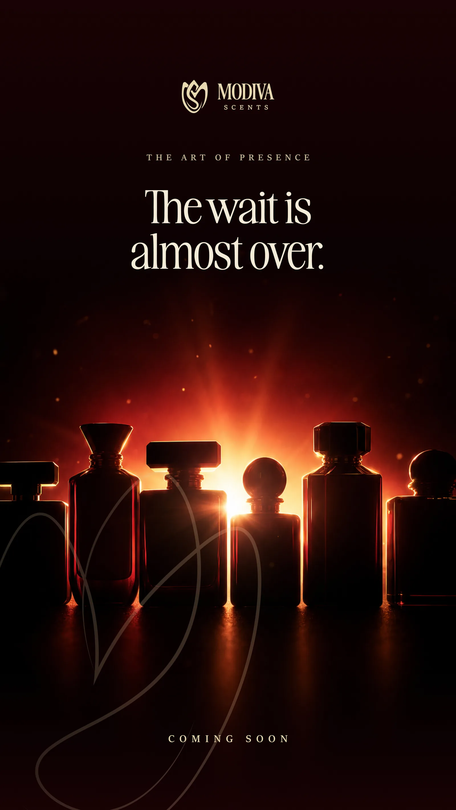
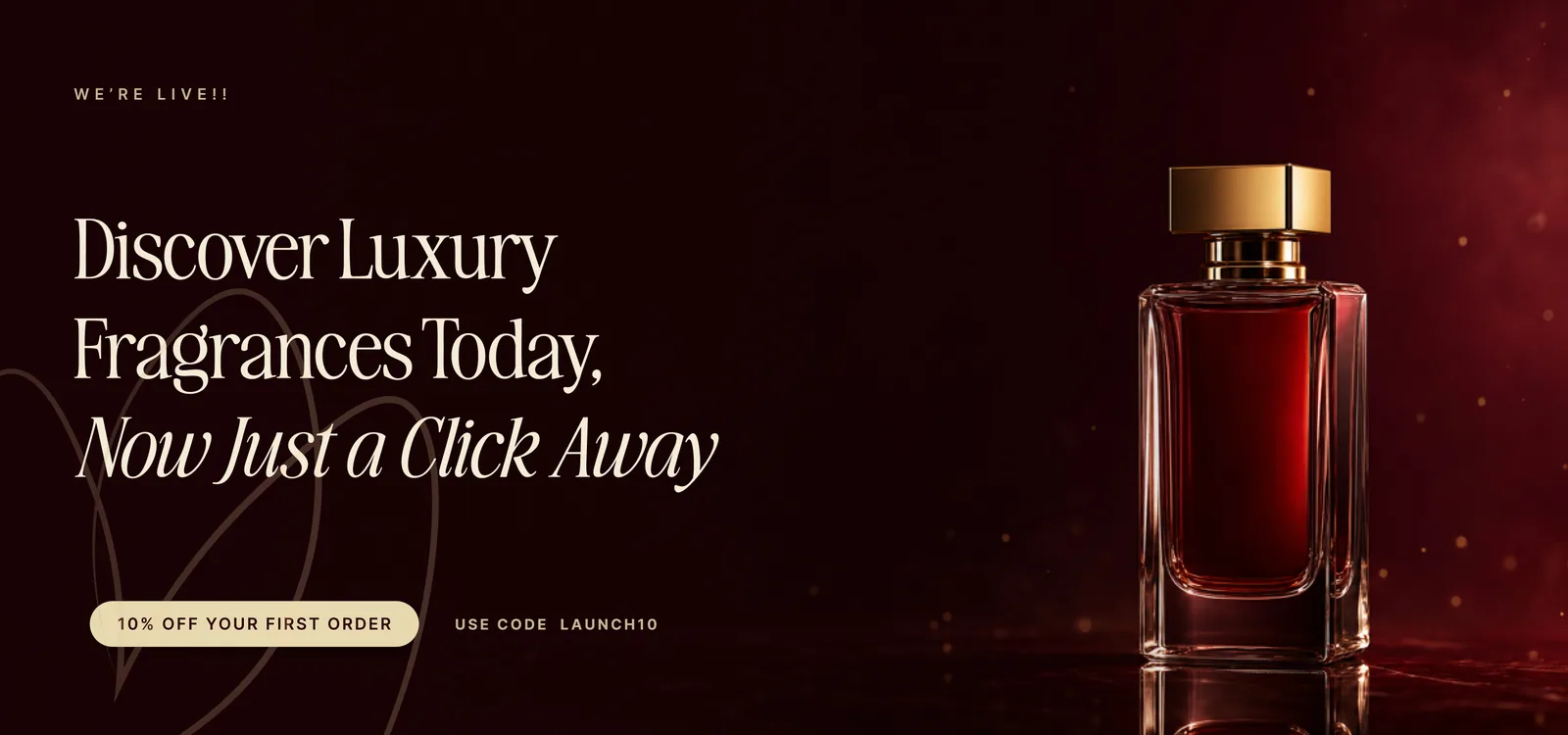
The launch was built as an arc, not an announcement. Four teasers ran in sequence: backlit bottles, shadowed glass, an address, a website. Each gave away a little more, so that by launch day the audience had earned the reveal and wanted the name confirmed. Art direction held one note throughout: dark-glow luxury, bottles lit from behind like stained glass.
A scent you see before you smell.
Identity & system
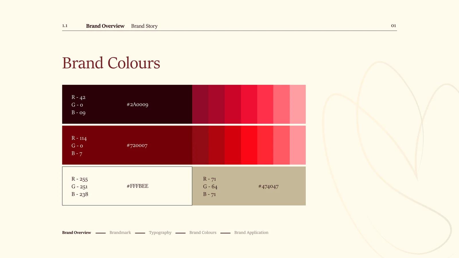
Sketches · tulip mark · palette
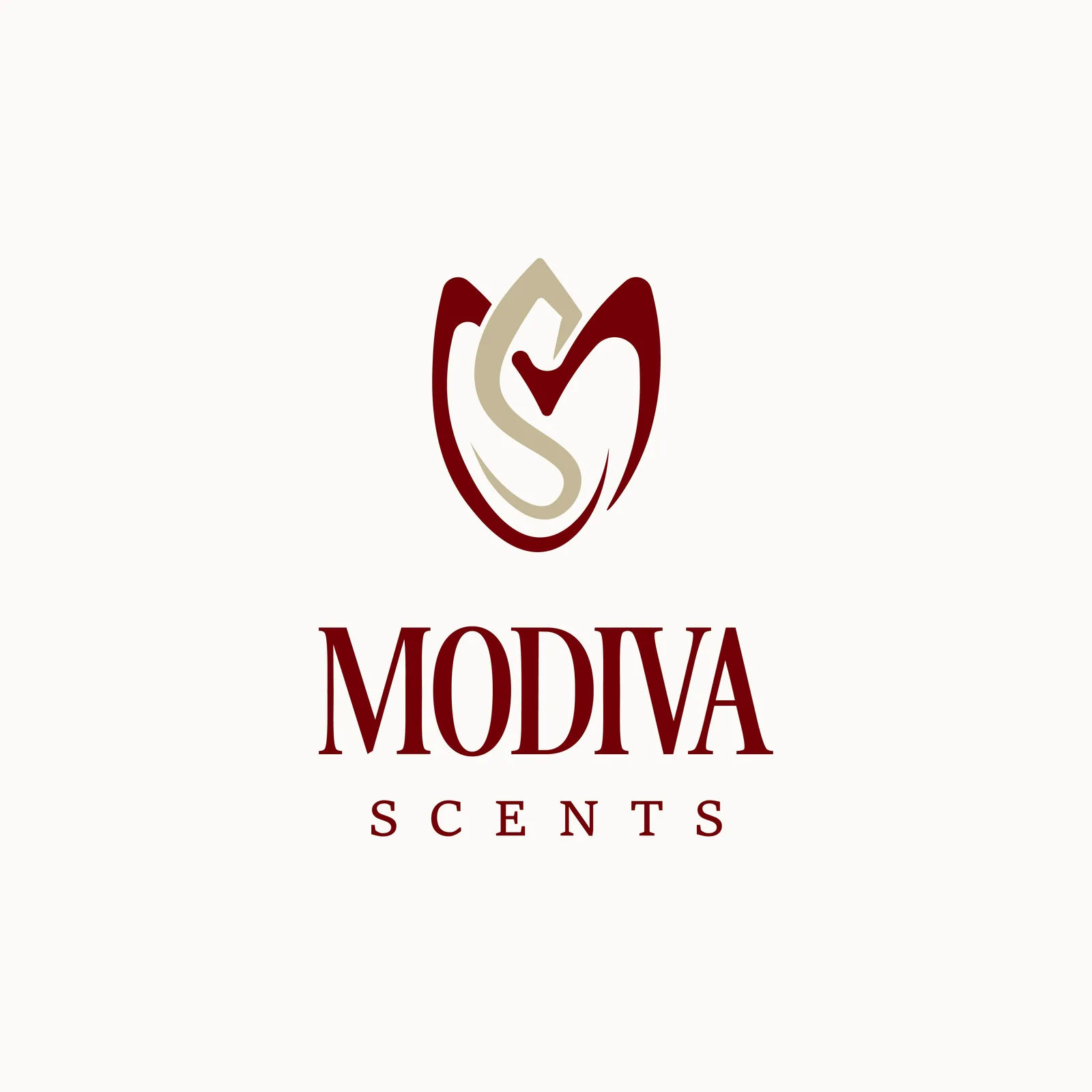
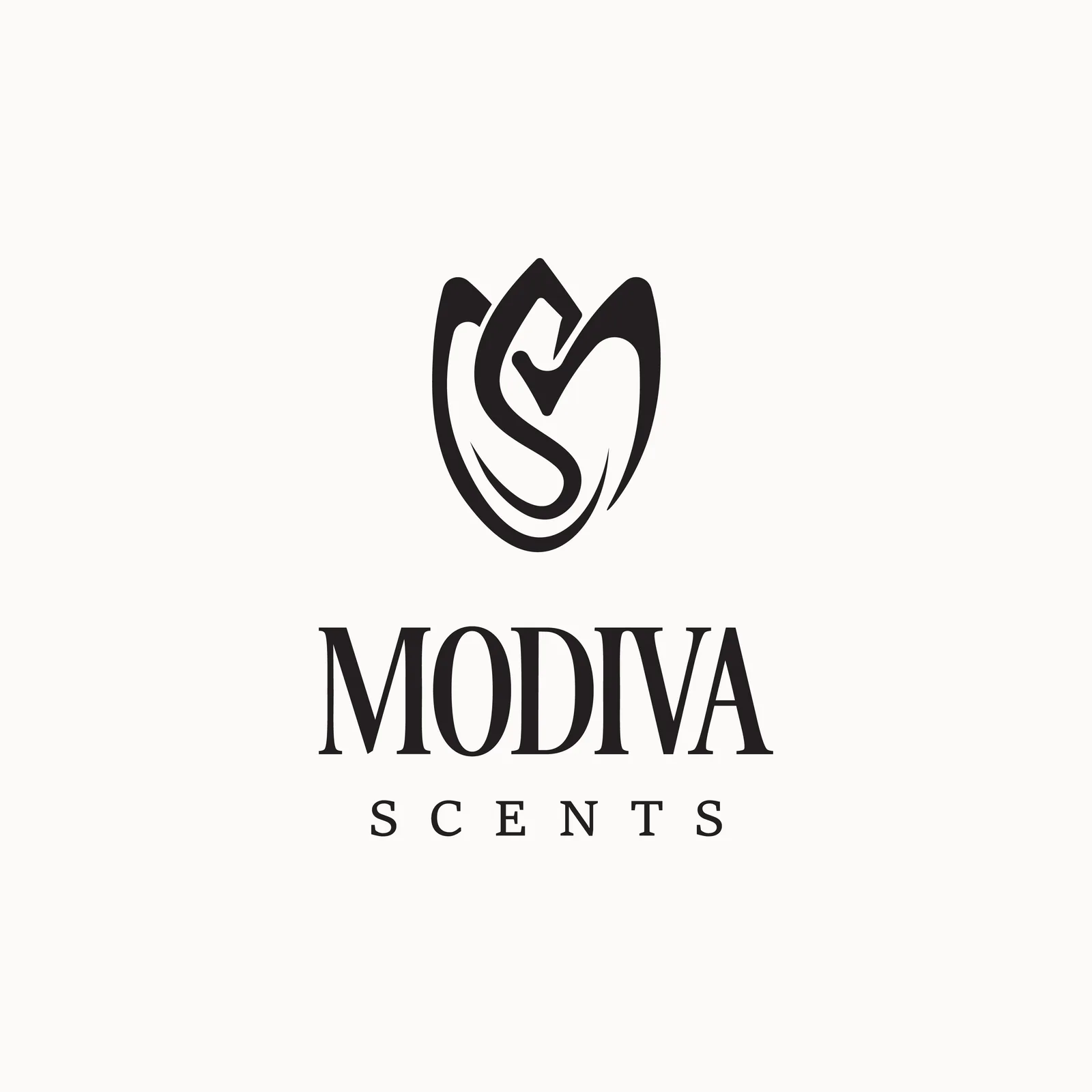
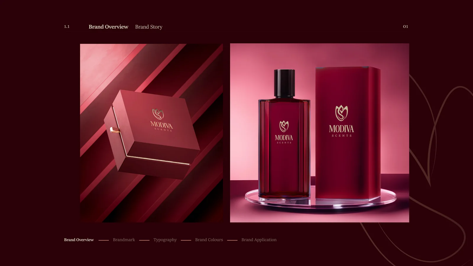
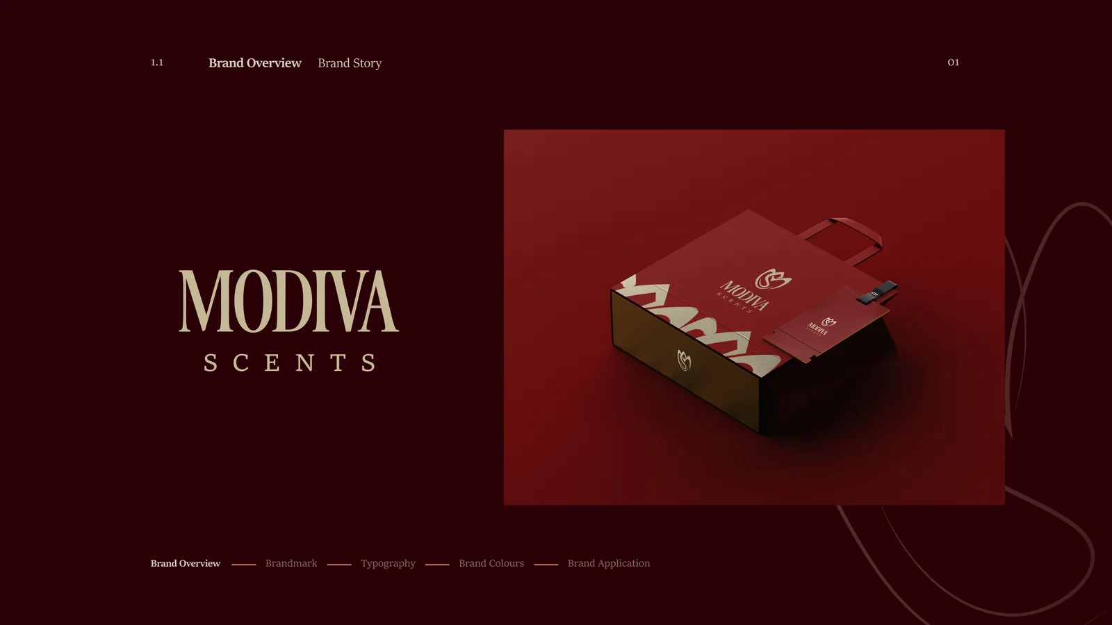
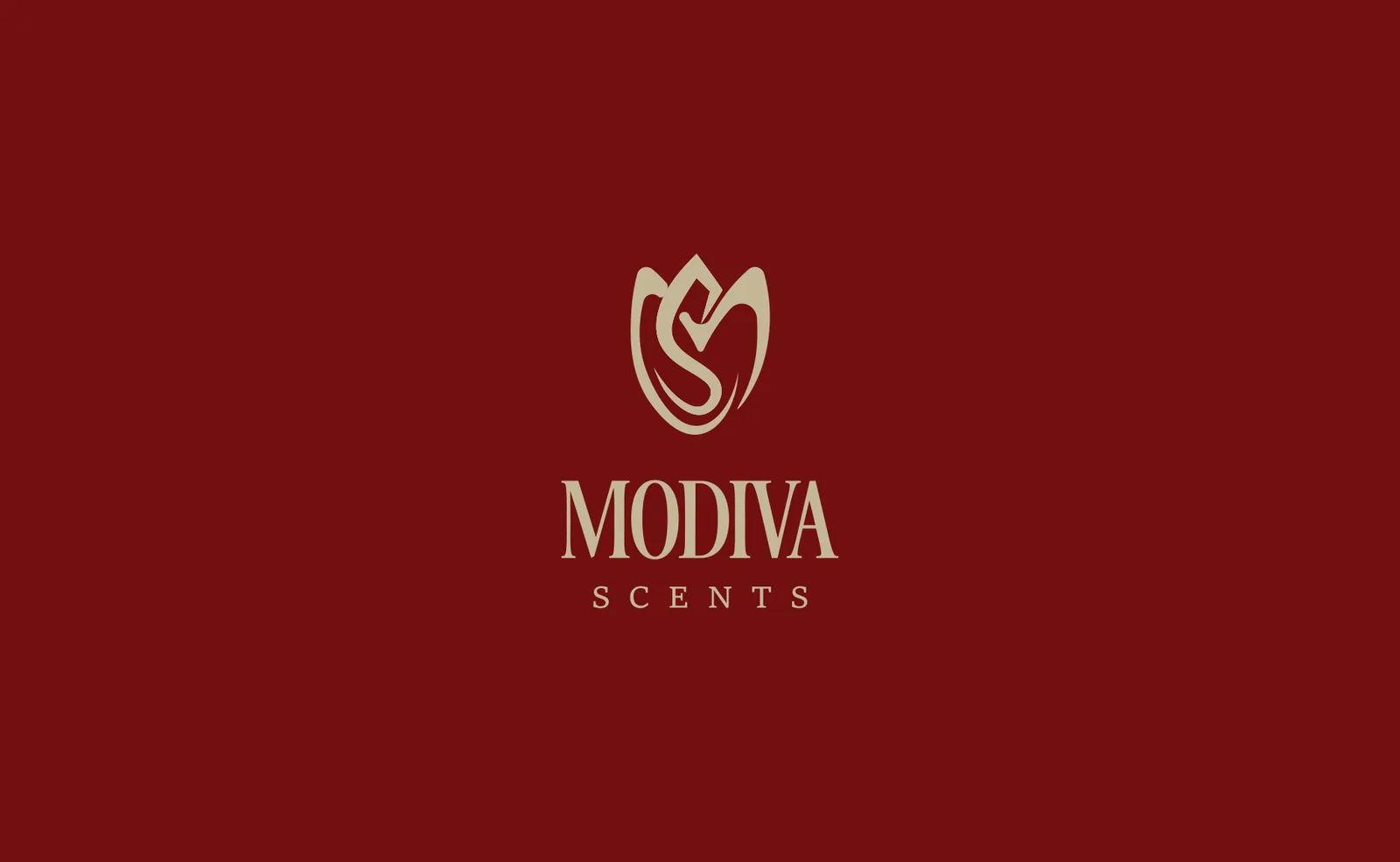
The identity started on paper. Fourteen logo explorations in pencil, worked until an M and an S folded into a single tulip. The final mark keeps the sketch’s looseness in vector form: oxblood petals with a champagne S curling through the bloom.
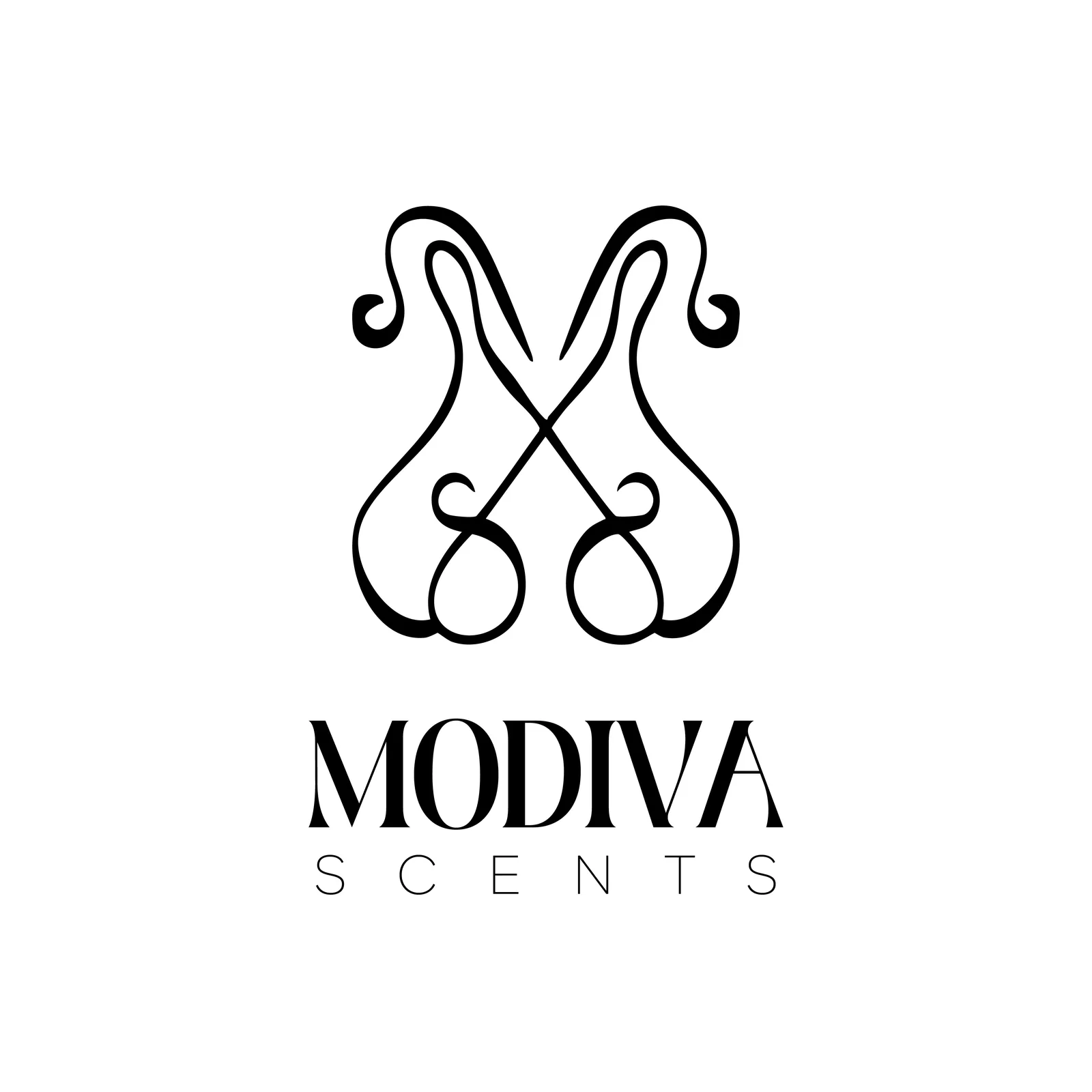
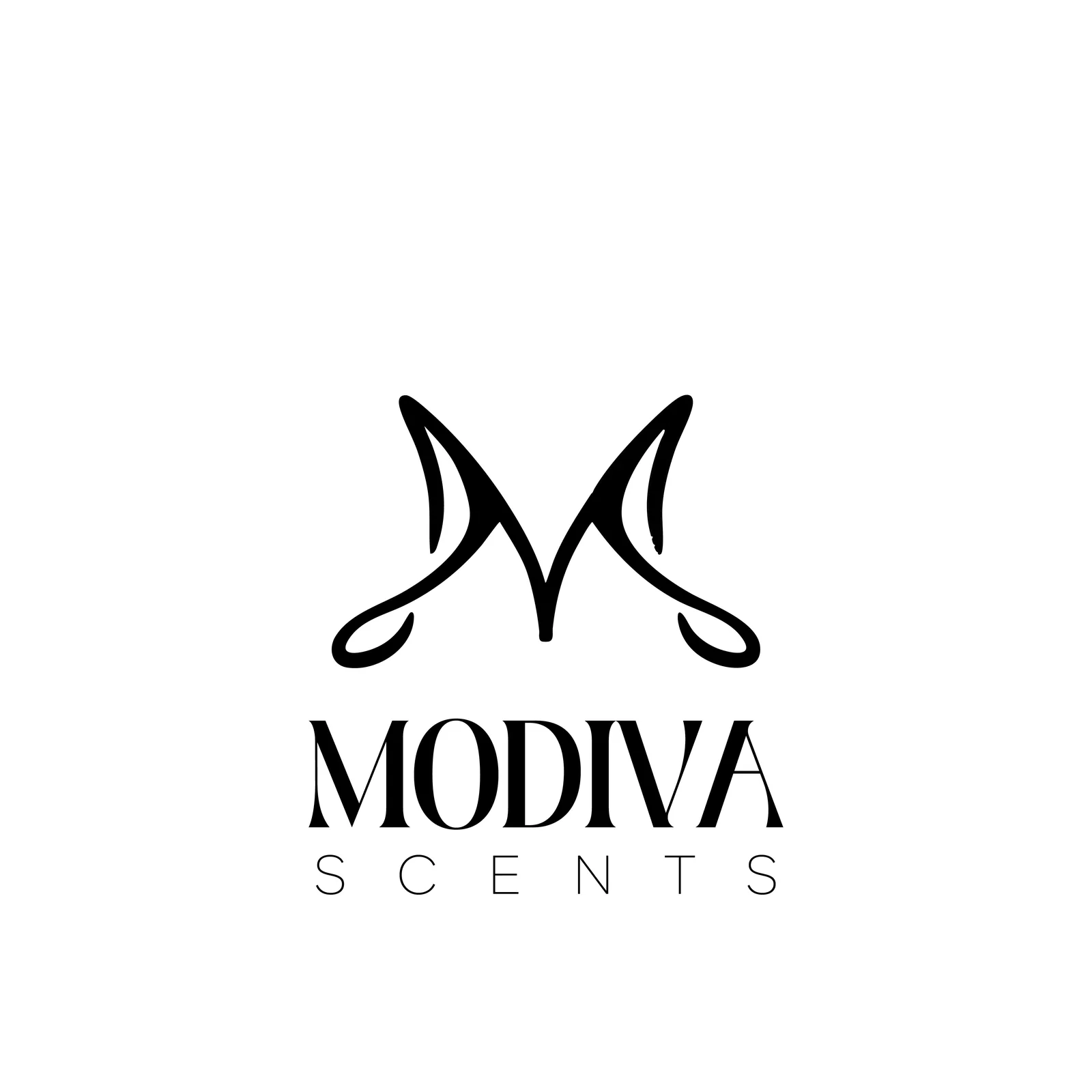
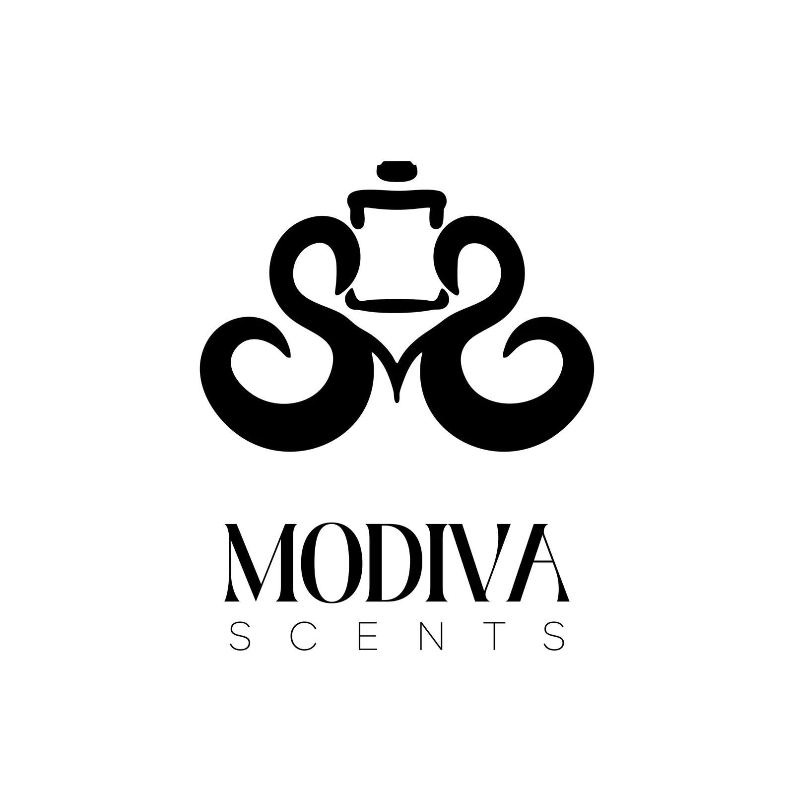
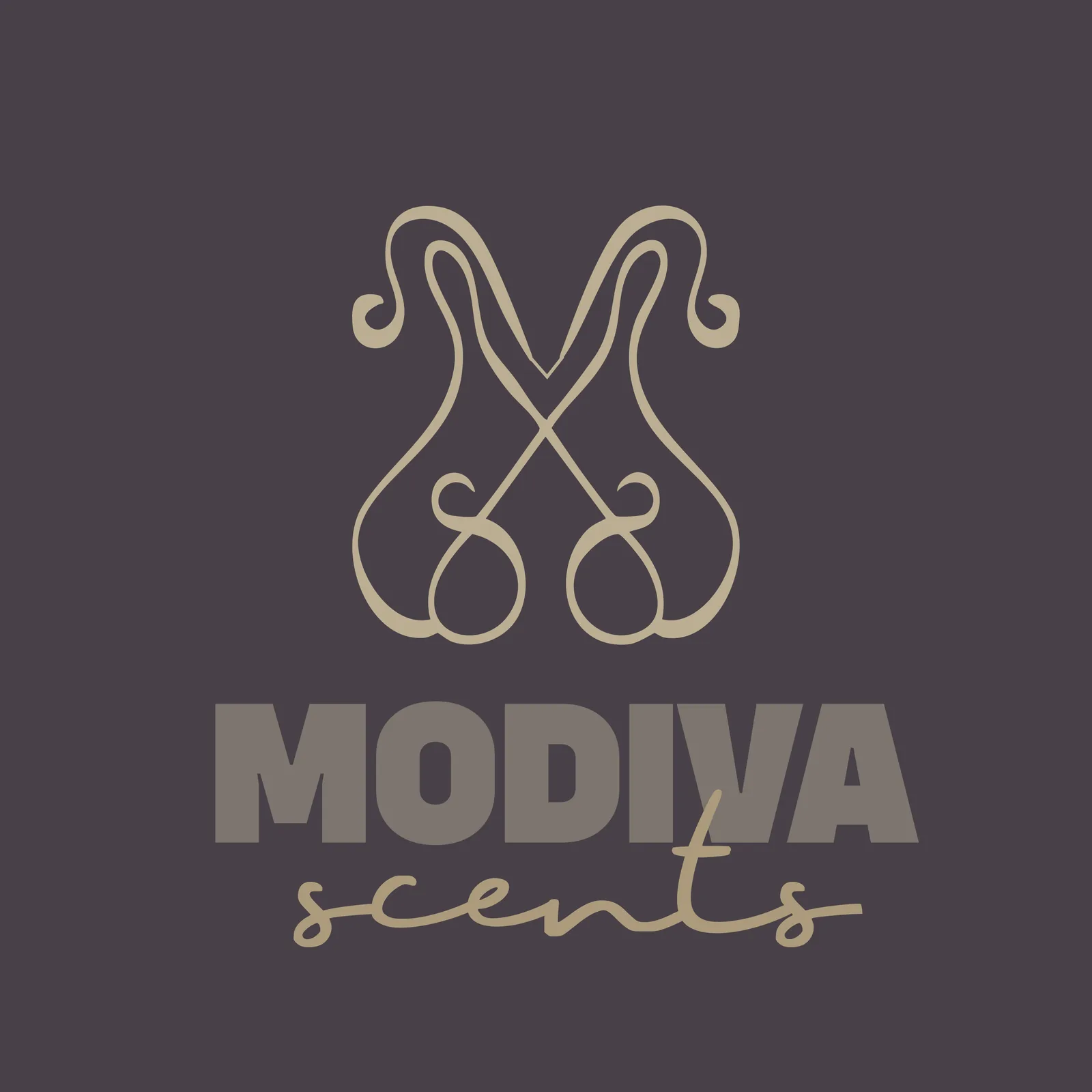
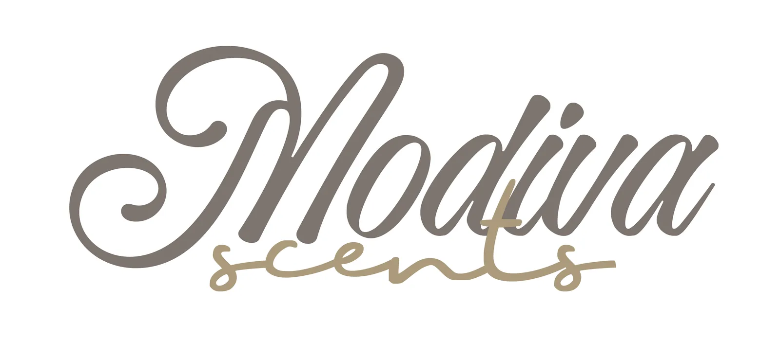
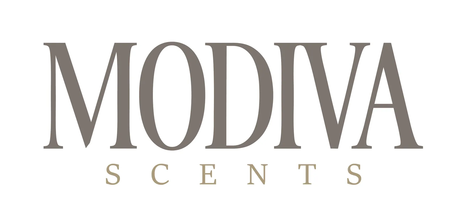
The mark ships in two voices: oxblood and champagne for the brand’s own surfaces, black for print and partners. Each runs as the logomark alone or the full lockup with the serif wordmark.


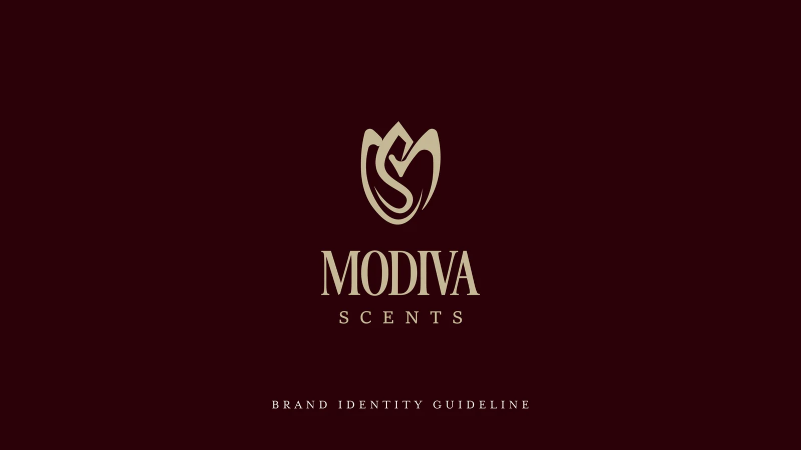
The system is documented. A full brand guideline fixes the logo, colour and type rules, so the house reads the same on a bottle, a bag and a billboard as it grows.
Rollout
Four teasers · one reveal
The sequence ran A to D: the backlit line-up that opens this page, bottles in shadow, the address, the website. Then the launch post confirmed what the audience had already guessed.
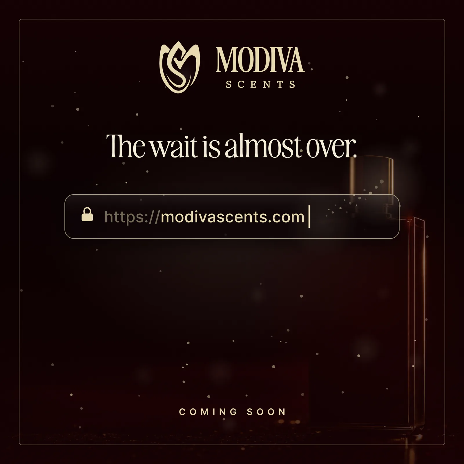
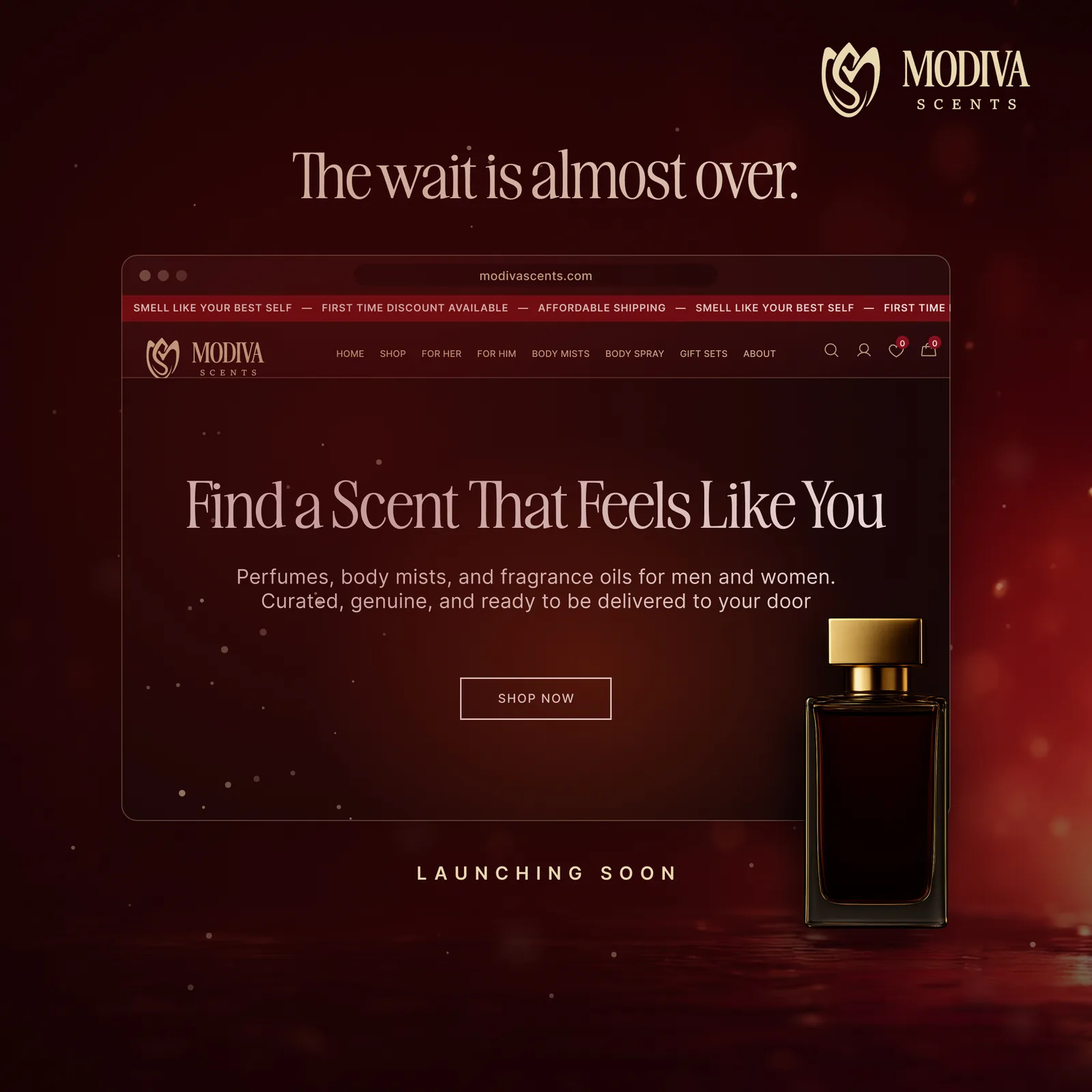
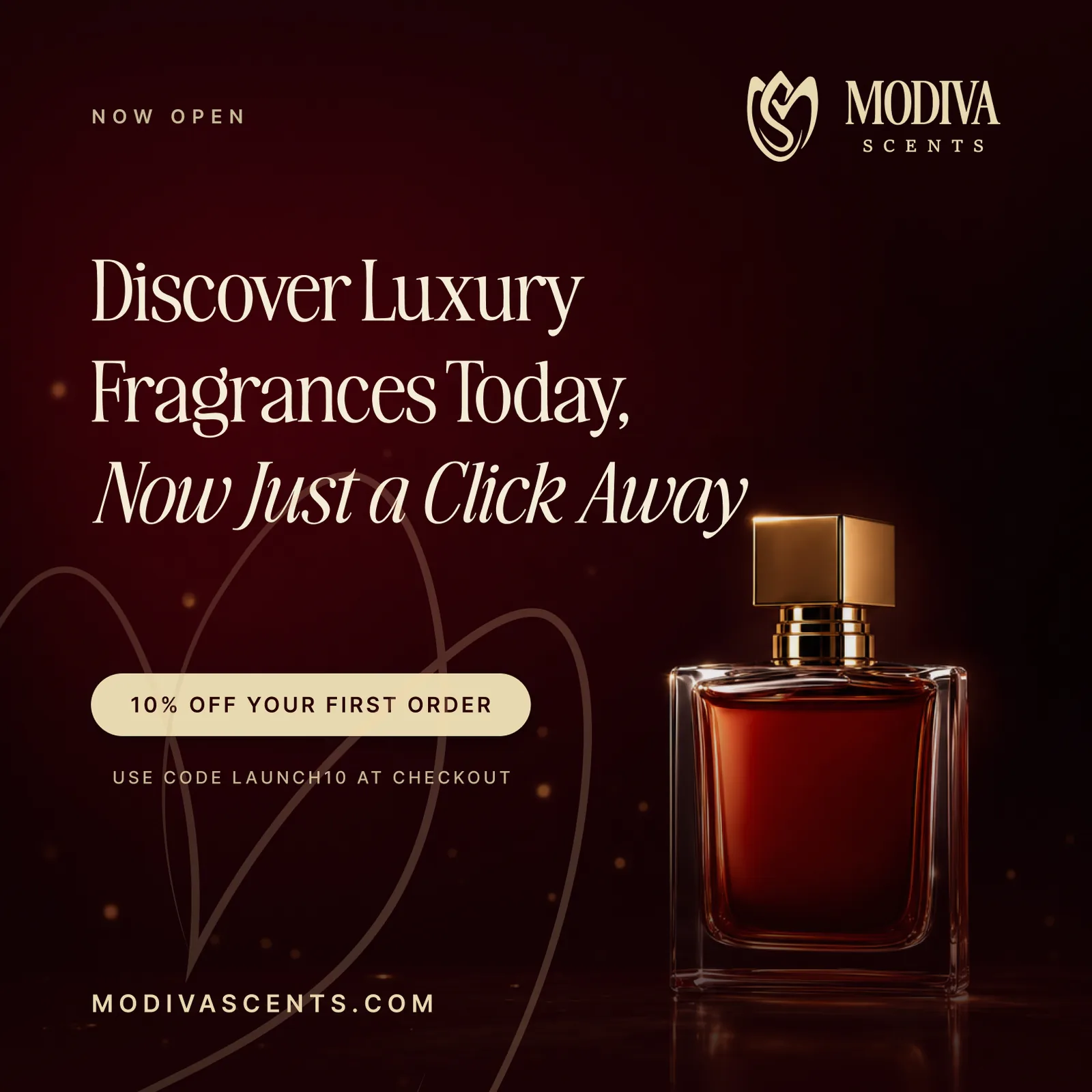
Stories ran the same arc vertically, and a web banner carried the reveal onto the site. Three formats at launch, one unbroken mood.
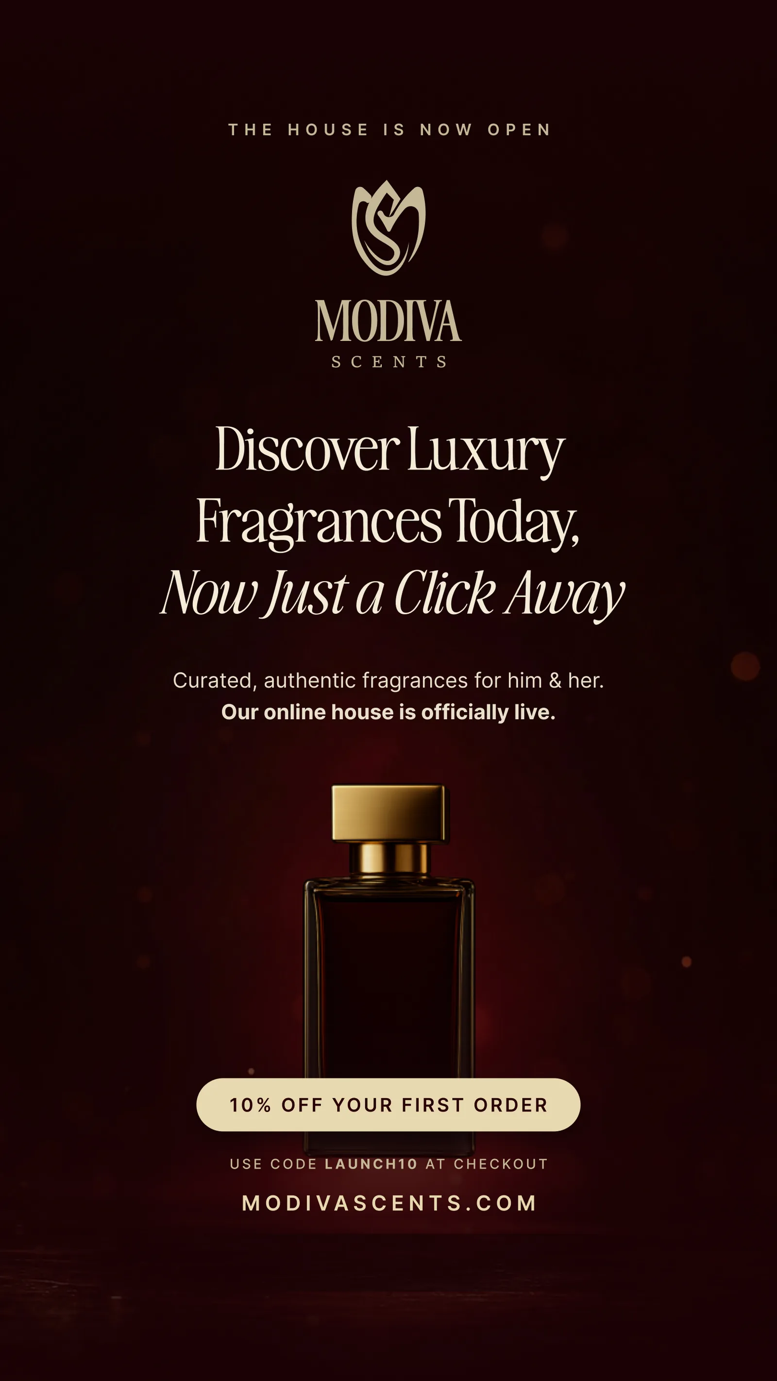
And it lands in the world. Packaging, the shopping bag and the live storefront carry the mood off the feed and into the customer’s hands.
Outcome
What shipped
Modiva launched looking like it had history. A mark with sketch provenance, a palette owned end to end, and a campaign arc that turned a cold audience into one waiting on a date. Identity and launch shipped as one system.
14
Pencil sketch explorations to land one tulip mark
4
Teasers in the reveal arc, A through D
3
Formats at launch: post, story and web banner