Case study 03 · Rebrand + motion
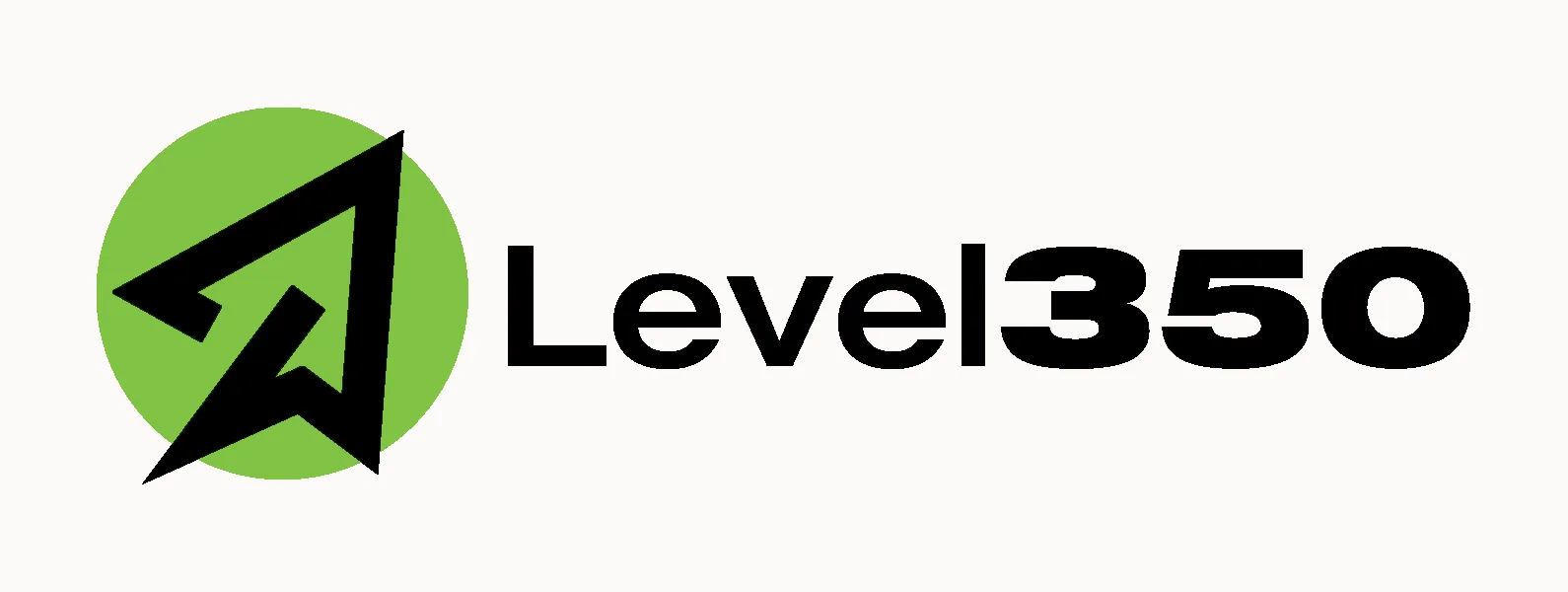
Level350
A company taking flight. Level350 was repositioning to serve aviation and airline clients. Embedded inside Diaz & Cooper, I led the rebrand that carried its equity into the new direction, from concept sketches to a final mark that moves.
Client
Level350
Role
Brand & motion designer
Context
Diaz & Cooper, US agency pod
Deliverables
Rebrand concepts · logo system · motion
Year
2025–26
From brief to rollout
Research & discovery
The pivot · concept rationale
Level350 came through Diaz & Cooper, the US agency where I work as an embedded designer on international projects. The company was repositioning to serve aviation and airline clients. The identity needed to signal that new focus without throwing away the recognition it had already earned.
Discovery framed the real risk. A hard pivot can orphan a brand’s equity. This was a transition, not a teardown, so the brief was a mark that reads as the next chapter of the same story, argued concept by concept.
- 01
The client is moving into aviation. The identity has to make the new focus legible on first read.
- 02
A pivot can erase equity. The rebrand had to carry the old recognition forward into the new direction.
- 03
Every direction deserved a written case. Concepts were named, argued and compared on paper before anything was polished.
Strategy
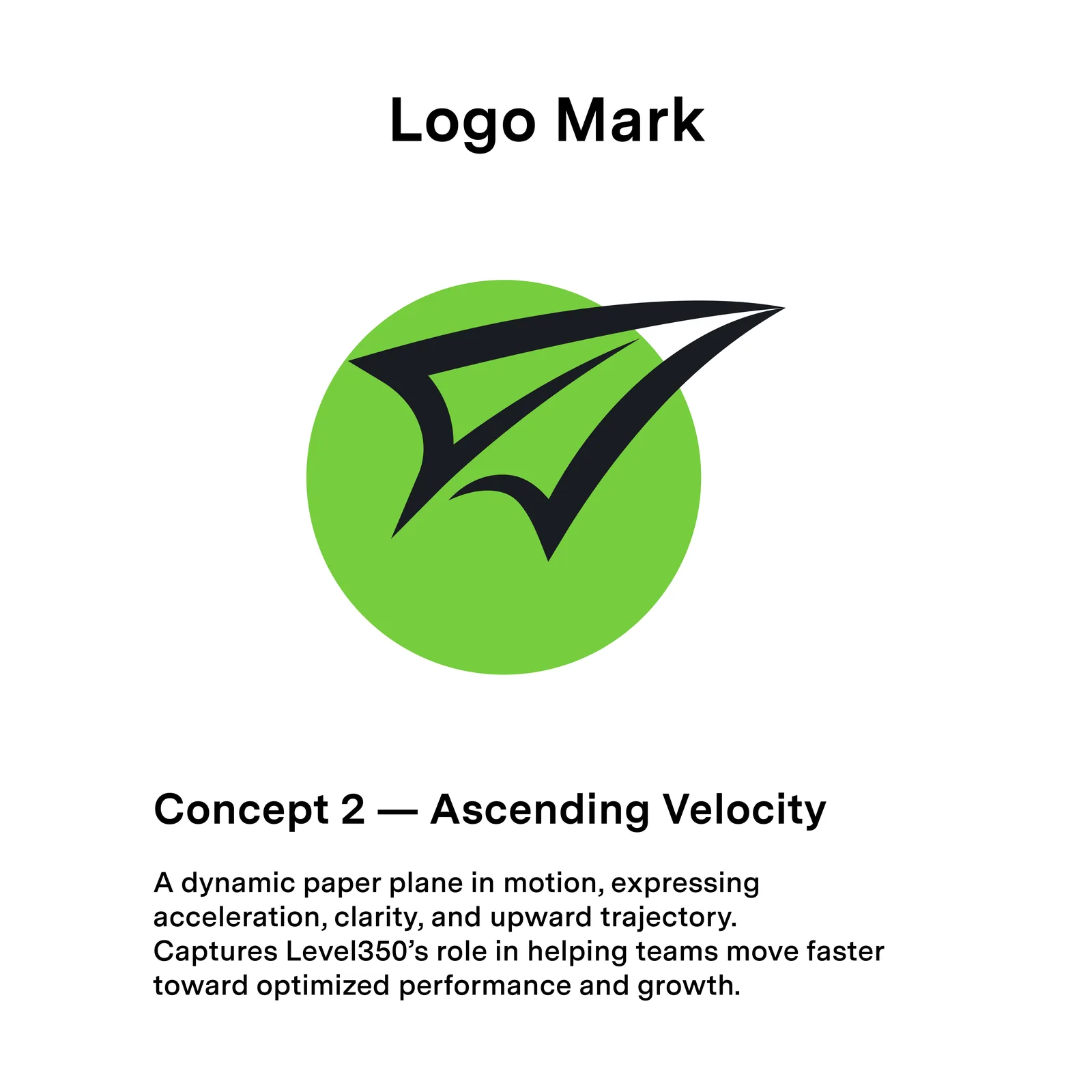
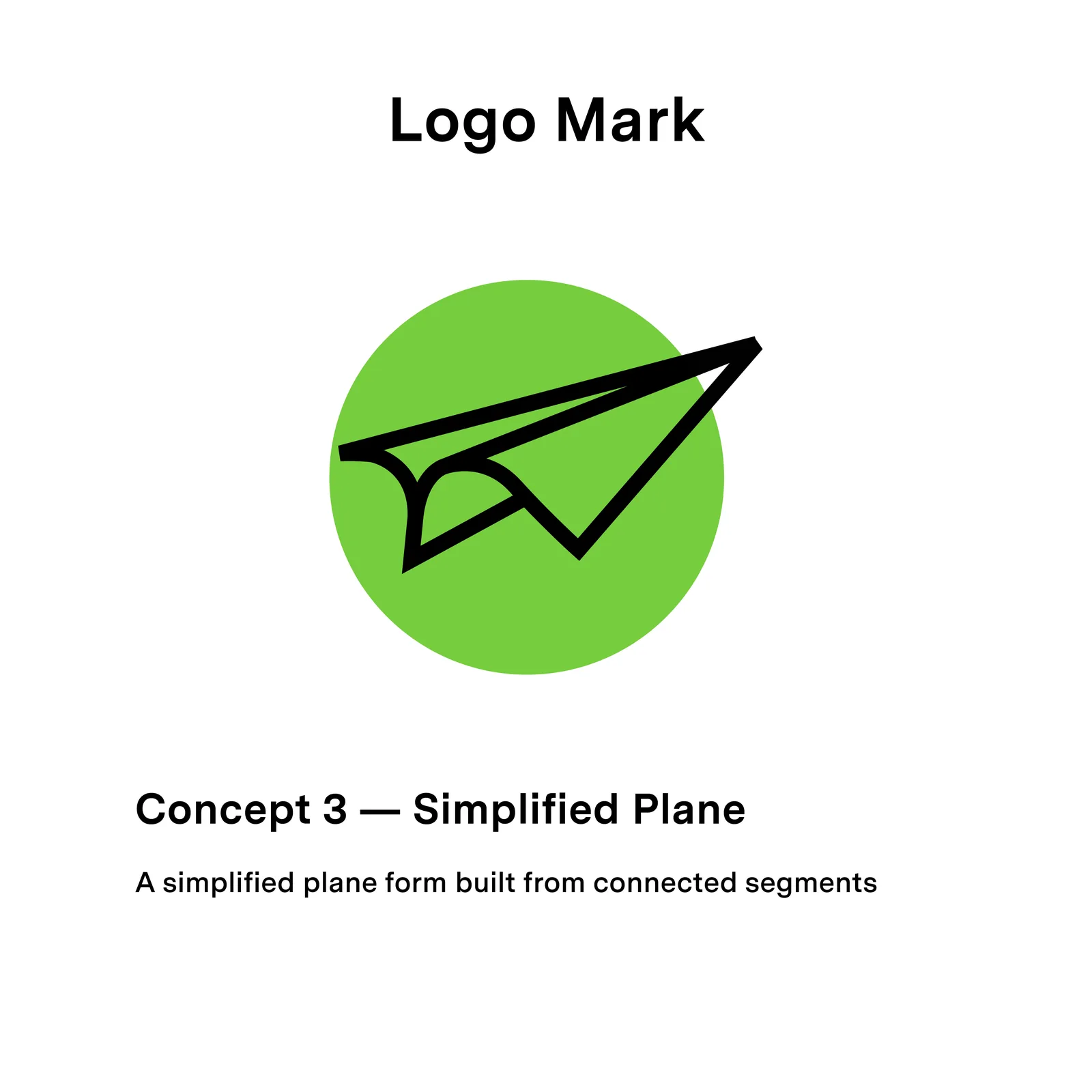
Four directions · one story
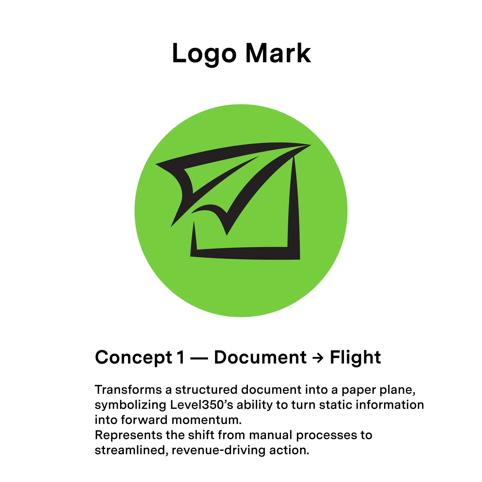
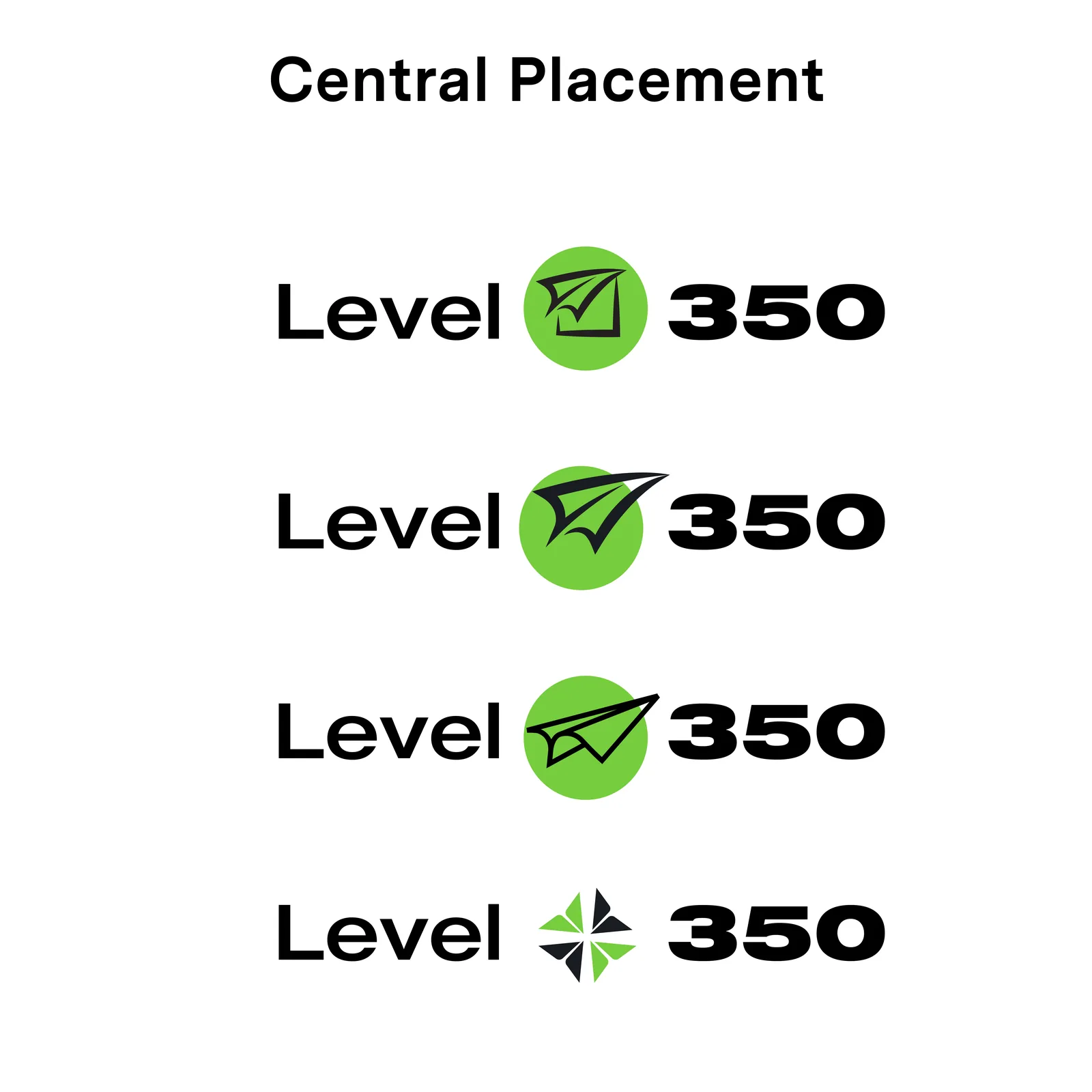
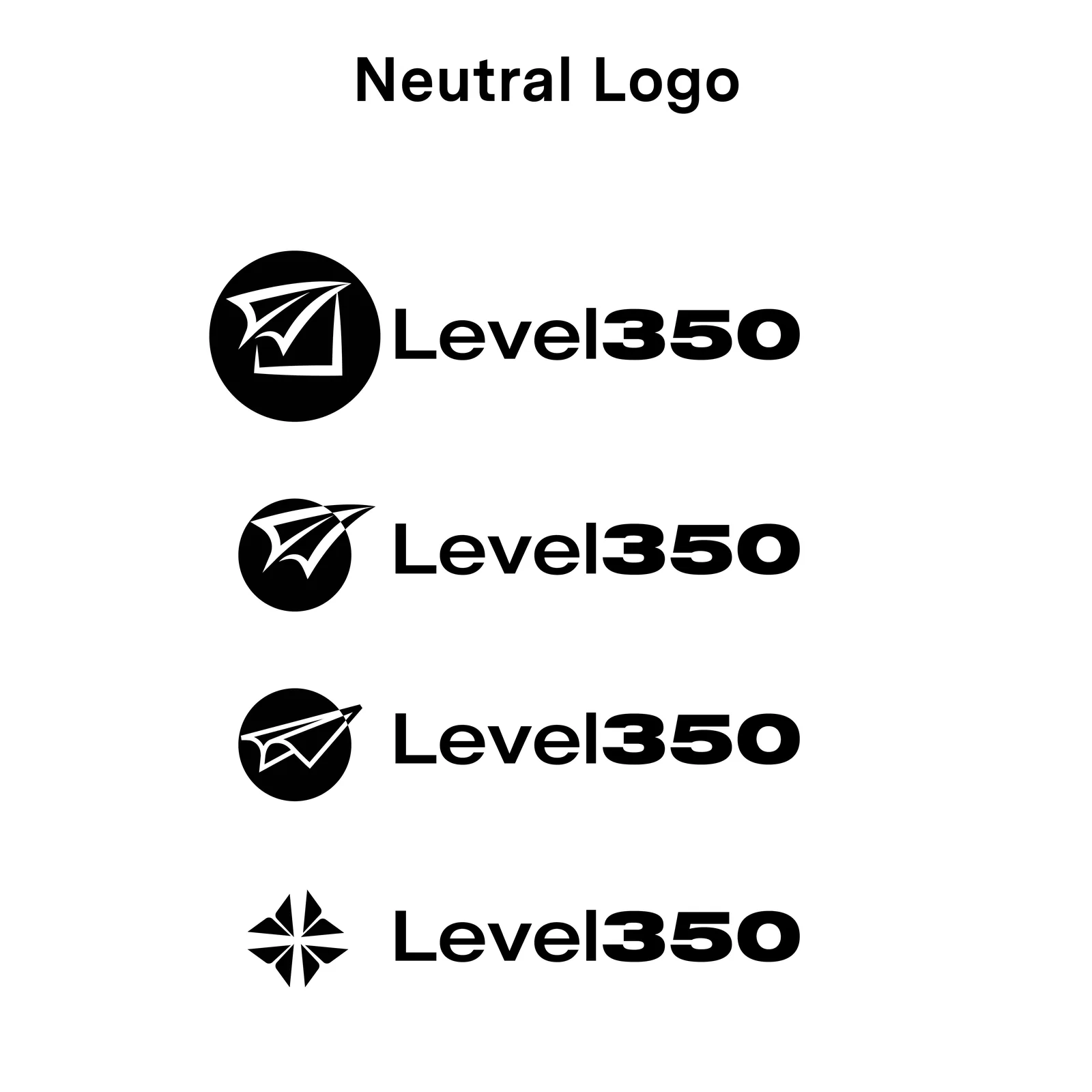
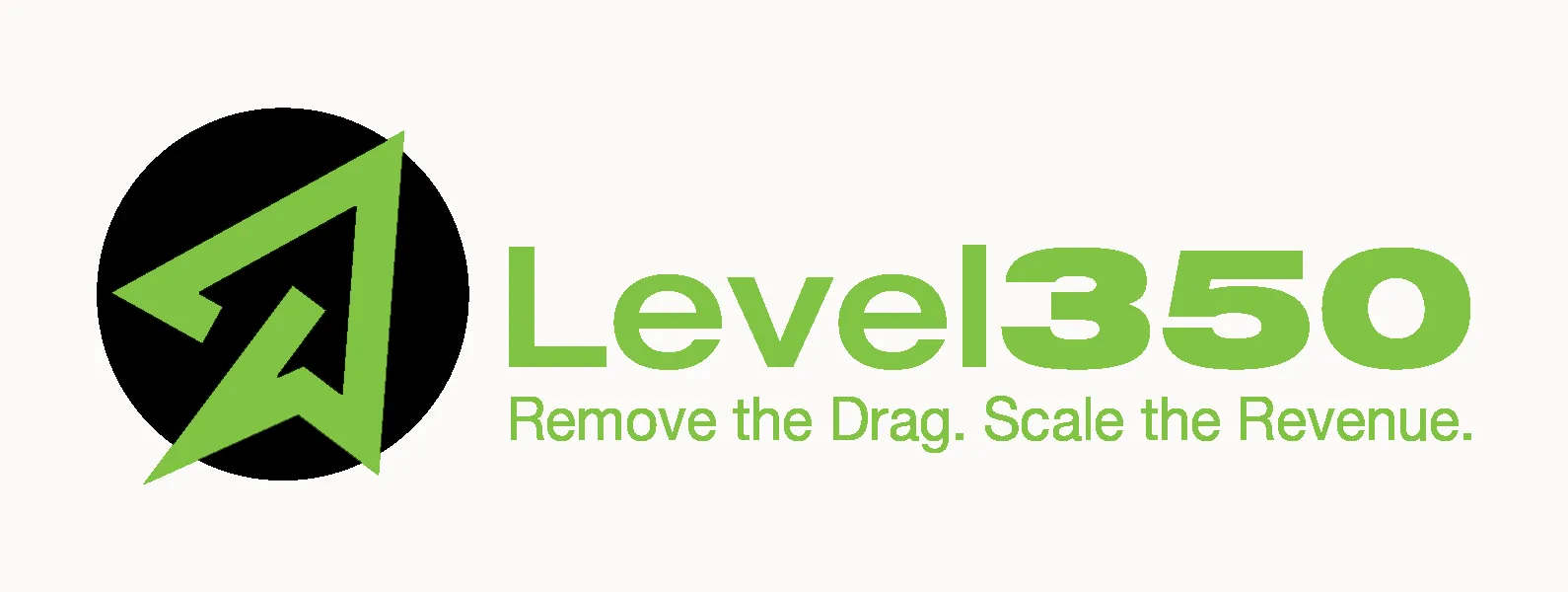
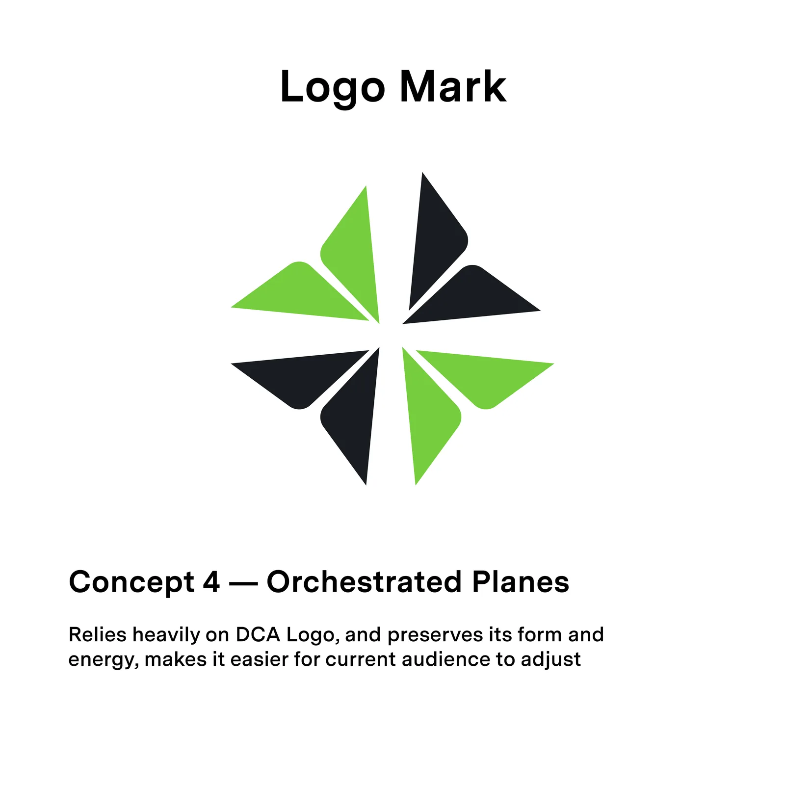
I spearheaded the transition with four named directions: Document → Flight, Ascending Velocity, Simplified Plane and Orchestrated Planes, each argued on paper. The winner was Concept 1: Document → Flight: the company’s document-and-records heritage folding into a paper plane. It draws the move into aviation as a single mark, with the old equity still legible inside it.
Not a teardown. A document that learned to fly.
Identity & system
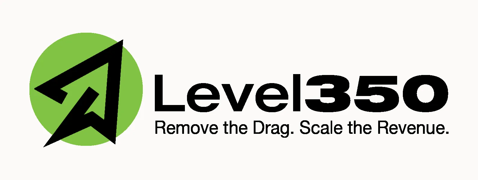
Construction · lockups · tagline
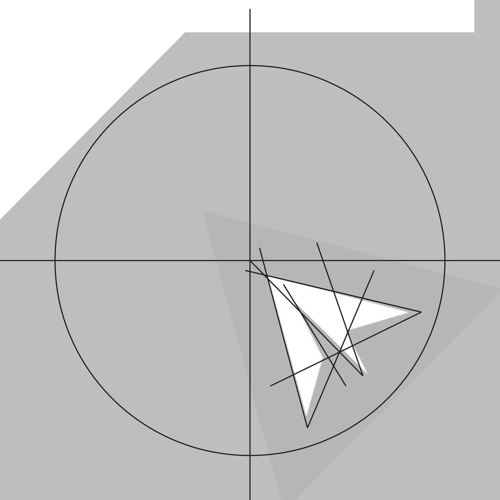
The mark is drawn on a geometric grid, built from circle, axis and angle rather than eyeballed curves, so it scales cleanly from favicon to trade-show wall. Type stays in the Helvetica family: plain, engineered, nothing competing with the mark.
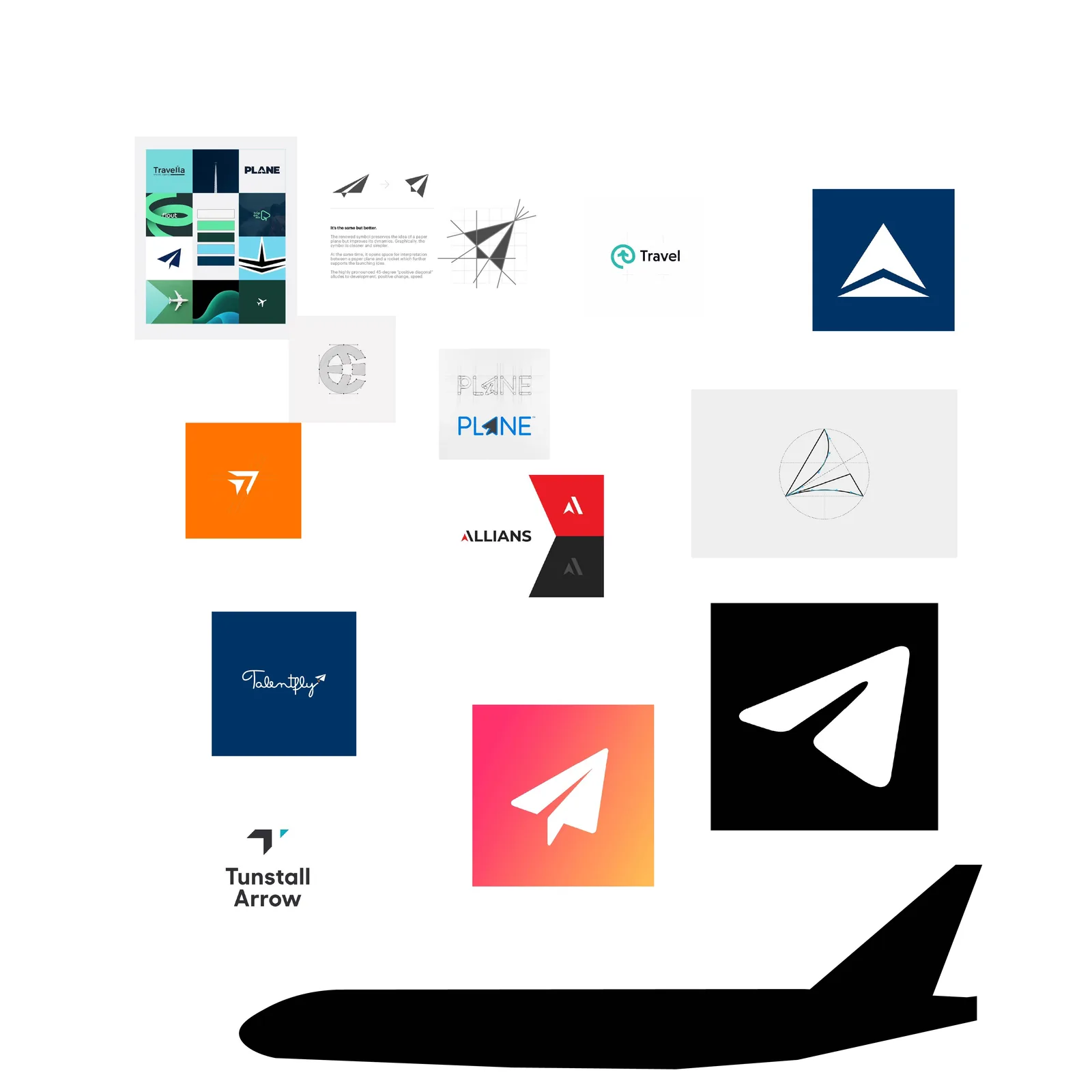
Getting there meant options, options, options. The mark and wordmark went through configuration after configuration before the system locked.
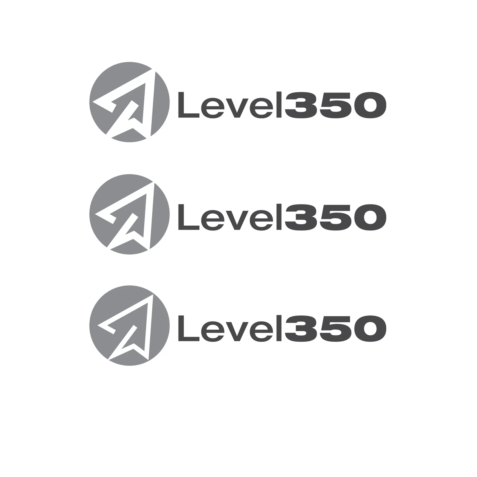

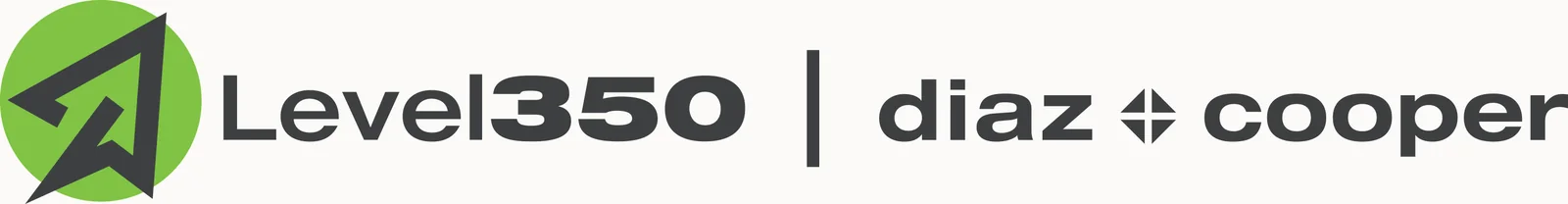
Lockups ship as a system, not a file: left-aligned, centred and mono versions, each with placement rules, so the brand behaves the same in a pitch deck, an app header or a co-branded footer.
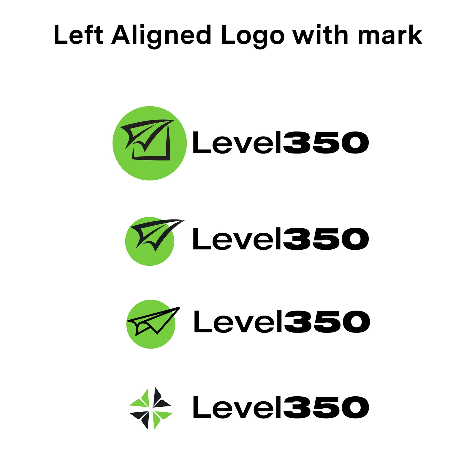
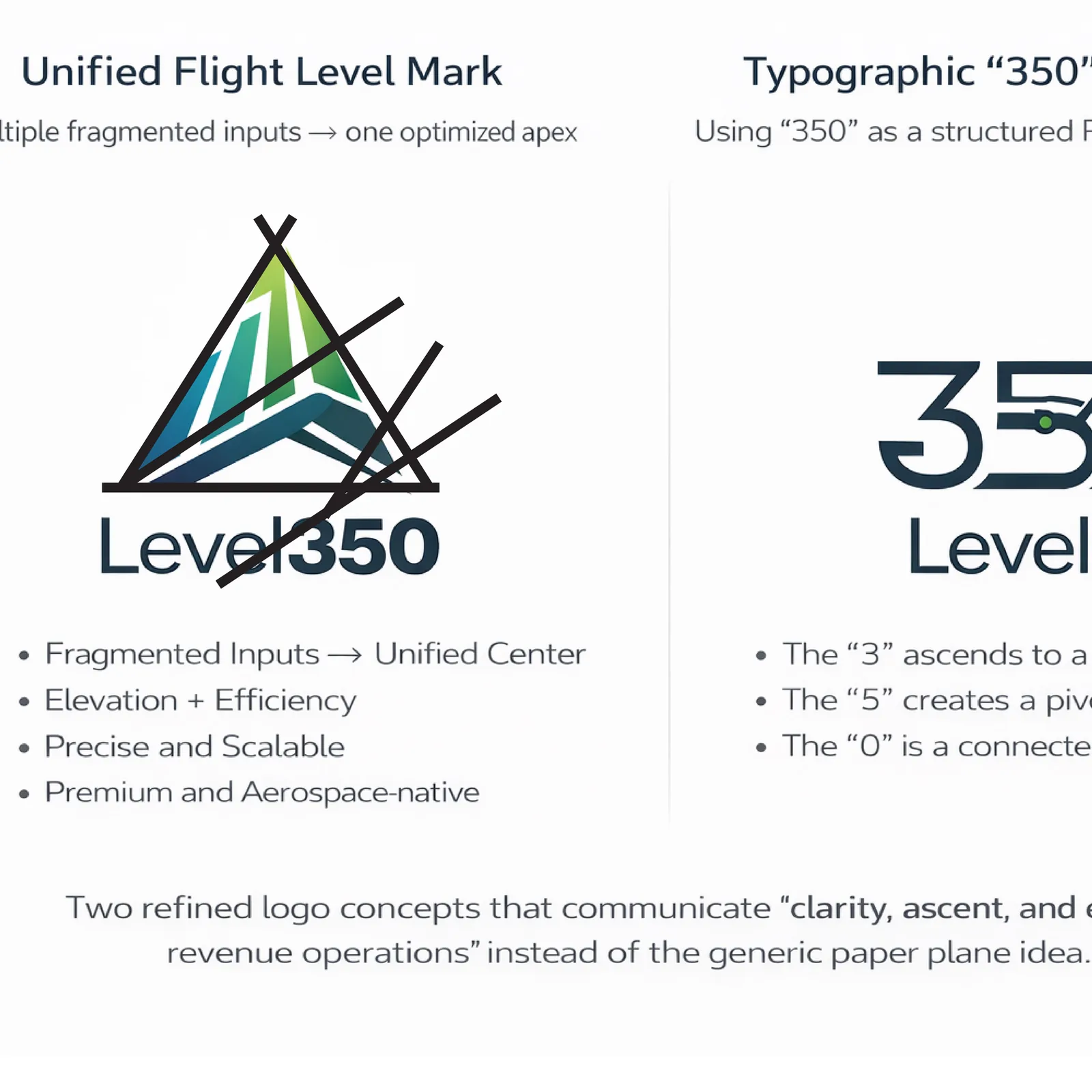
The three unchosen directions were real contenders, not filler. Each was argued in the same format as the winner, so the client’s decision was a choice between stories, not sketches.
Rollout
The mark, in motion
A rebrand only counts once it ships, and Level350’s first shipment was motion: an animated logo transition that folds the document into flight, and a brand intro that sets the whole system moving. Same geometry as the static mark, now with timing.
Logo transition and brand intro: the fold-to-flight story, now moving.
Outcome
International proof
Level350 walked away with a defensible mark, a lockup system with rules, and motion that makes the brand recognisable before the wordmark resolves. For me it is the useful kind of proof: international client work, shipped through an agency pod, from concept sketch to moving image.
4
Concept directions explored and argued to land the one
2
Motion pieces shipped: logo transition and brand intro
US
Client, delivered through an international agency pod at Diaz & Cooper